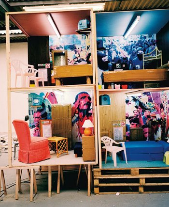
IDEAS FACTORY (PT.1) 120917
Gather= act of bringing together things in order to present them as a whole. Working with this idea, mediums such as collage comes to mind. However, the gathering of people behind one idea is basically the definition of propaganda...
- Collage itself is a bit counter-culture, rebellious; selectively cutting and gathering images, and then juxtaposing them in certain compositions. For example, in an advert on a magazine or newspaper, the images and text are organised in a way that is telling its viewer to do something; however, a collage plays with this idea by altering the original meaning of the source.
- In other words, collage is basically gathering information from the source, then altering them to have a meaning different from its source. This ultimately evokes a satirical or ominous theme about the works
Thomas Kohler in Manifesto Collage believes collage works are "almost always political, collage is... a technique and message", and "employed by a range of artists ...playfully and subversively ". Likewise, Christiane zu Salm also in Manifesto Collage believes "collages are an important means for many contemporary artists to explore the diversity of social realities". It is interesting to note that simply gathering images and presenting them as a whole, what is Thomas Hirschhorn (also in MC) believes as the most powerful means of expression.pore
On the other hand, propaganda is people believing in the same idea. It is utilised by large organisations to sway the public opinion. Artists play with this notion and alter the message itself. For example, Martha Rosler's Gladiator (2004) juxtaposes photos of American Marines in somebody's living room. By using photos of Marines that the public can easily identify with, then gluing them in someone's house, it inevitably evokes a sense of confusion at this unwanted presence-- what the public American would have believed in America's involvement in the Gulf.
Ice
Ice= It could be solid water, it has preserving and reliving properties and can describe somebody. My group wanted to incorporate ice's ability to melt (duh), and from there it reeks of climate change overtones. So naturally our references would be icebergs and glaciers melting.
- Ice sculptures were ruled out because as a medium it didn't provide anything special other than being cool
- Throughout the first day we pondered with the ideas of freezers and fridges, because it definitely had the climate change theme. We abandoned it because it would limit our project to only be installations
Stefan Hunstein's collection of photos in his In the Ice photobook forces the readers to reevaluate their concept of icebergs. Normally being all big and capable of downing ships, the once mighty chunk of ice is slowly melting. In Ice No.16, in the foreground there is a solid block of white iceberg, and slightly below it is its reflection in the water, surrounded by numerous little bits of ice. In No.51, we see something akin to our ice cube in a drink; the last bit of ice struggling to remain solid and not melt. Likewise in No.118 a wall of ice shows destress by having a chipped surface, alluding to its eventual fate. Hunstein could have photographed a bunch of ice anyhow, however he chose to present them in a way that gave they human qualities--animism.
Futurism
Futurism= the movement seeks to capture "art the dynamism and energy of the modern world" (Tate.org.uk) Its core tenets were denouncing the past, and embracing everything that is dynamic and modern. In Marinetti's manifesto about Futurism, one that stood out most was "We affirm that world's magnificence has been enriched by a new beauty: the beauty of speed." (Futurism, Richard Humphreys) Futurism doesn't have a certain aesthetic to it, sure some artists adopted Cubism and neo-Impressionism because they were avant-garde, other than that, they were only united by their common idea of modernist ideas.
- As such, the project needs to exhibit a sense of dynamism, lots of energy, fearlessness, audacity and violence (all essential elements of Marinetti's manifesto)
More Futurist Stuff
Delving deeper into the realms of Futurism...
- "The futurists advocated the destruction of traditional poetic language regulated by laws of causality in favour of a new language based on intuition"
- Marinetti wants to revolutionised how people live their lives, by dismantling the language first, he hopes to rewaken the human spirit
- "From a technological and philosophical perspective, the traditional Newtonian concept of the universe collapsed...The futurist aesthetics of speed reflected the poetic perception of a chaotic universe... Chaos was elevated to the status of a poetic principle"
- Marinetti believes technological advances has influenced the human psyche, especially how there's a "new dimension in speed" in transportation and communications
To sum it all up, the Futurist did not have a certain aesthetic style, instead it were the core tenets that was reflected in their works. Love for all things fast, destruction of the past, and idolising the machine were basically it. Tying it to my work, it has to exhibit the feelings of outrageous self-confidence, aggression and modernity.
Humphreys, Richard. Futurism. Tate, 2006.
Tate Brit+Mod
Posting here for future ref:
SURGICAL WARD, 1939--SAM HAILE AUTUMN COMPOSITION, FLOWERS ON A TABLE, 1932-- IVON HITCHENS
- Haile here paints something violent, without the use of aggressive strokes like Ivon Hitchens's "Autumn Composition, Flowers on a Table"
- Hitchens used rags, heavy brush strokes and his palette knife to create an "active surface"
- For me, Haile creates an unsettling composition, that is reinforced by his weirdly childlike wonky lines.
- Whereas like Hitchen's composition looks aggressive, but it's really just some flowers on the table...something like what the Kitchen Sink painters would paint 20 years after
PELAGOS, 1946-- BARBARA HEPWORTH
- holy shit it's so beautiful
- What really gets me it's how simple it is, so it's basically a ginko nut cut into a spiral kinda shape
- The strings and the thin layer of wood would stand out with plaster, but Hepworth unifies them by:
- having the strings all taut (tension)
- the intersection between the wood and plaster is invisible, it's like the wood was laminated on then the plaster covered the edges
- Aesthetically and technically this is a very well done sculpture; taking a shape we all know, then carving the inside out
DRONE BALLET, 1940-- EDWAR WADSWORTH
- I'm not sure what to call this technique, but he uses other colours to substitute those in real life
- I'm pretty sure the dark sides of the propellers weren't orange, or like the shadows it casted were bluish orange
- that being said, I think it's quite pleasing how Wadsworth uses colours that are opposite each other to make them darker (duh)
- And yes the propellers are arranged in a way that makes them look like dancing starfishes (animism right there bruh)
CROWD, EARLS COURT, 1953-- EDWARD MIDDLEDITCH
- Seeing this up close was really a treat, it was massive and the solid chunks of black and grey really gave it a gloomy look
- The background consists of three colours, and all of them looked unblended
- There are a lot of detail trailing up to the crowd, then it all ends abruptly
- It's interesting because it makes sense the throng of people don't have much detail, but the street and background is quite empty
SKIPPING (THE GUTTER), 1934-5-- WILLIAM ROBERTS
- Aside from the subjects having a Sovietish feel to them, I also find the subdued colours of this piece interesting, like each individual colours could bleed into each other
- I know Robert is focusing on the working class in America, so maybe that's why their hands are so big, maybe that's also why the subjects resemble the buff labourer we see in Soviet Realism
- On a personal note, the muted colours reminds me of my childhood, flipping those Chinese art books and looking at a lot of Russian paintings.
GADDAFI 3, 2011-- WILHELM SASNAL
- The brain fills in details when given an outline
- in this case, we can recognise the the black figures around Gaddafi's body, just using the some shadows and outline
- It's based off a photograph, so we can tell the perspective is not very natural
- With only the chin visible, Gaddafi's body is nothing much
A MI-VOIX, 1958-- DOROTHEA TANNING TABLE PIECE CCLXI, 1975-- ANTHONY CARO
- Are there works that you just see and thought, "wow I bet artist had a wonderful time making this"?
- Tanning's idea was to "paint a white and gray picture that would still have color in its veins as we have blood under our winter-white skin. And lots of unexpected light sources’"
- You see three figures just chilling around a table, and really I just think that's it
- I'm not too sure if this happens to big artists too, but maybe they are forced to have an idea behind a piece of work, so they b.s something up
- Caro's piece looks like something I would do (If I knew how to work metal)
- Other than it needs to be balanced, it looks real sparse and really bland
ISHI'S LIGHT, 2003-- ANISH KAPOOR
- So it's big and encapsulates you with you (since it's reflective)
- It has thin edges and two contrasting surfaces
- It takes a common shape and carves it out, like Hepsworth
- It's really beautiful
CHROMES, 1970-- WILLIAM EGGLESTON
US CUSTOMS AND BORDER PROTECTION, CONTRABAND ROOM JOHN F. KENNEDY INTERNATIONAL AIRPORT QUEENS, NEW YORK, 2007-- LYNNE COHEN
- It could be argued that there's less room for ambiguity when the subject is a photograph
- A box of rotting food and agriculture, a random gas station in the States, both pictures were not staged in anyway
- Aside from vibrant colours, both pictures just transport me to a nice place in memories
Poetic Cardboard
Some artists who work with photography, moving image or just text (conceptual approach to image making)
- ALEXANDER RODCHENKO (a really inspirational guy, need to research more)
- Aside from his Worker Suit, I learnt that Rodchenko could be one of the first designers
- "[Rodchenko] denounced painting as a domineering visual genre, preferring design, which challenged the notion of a work of art as a unique commodity, and, even more radically, promoted the idea of an artist as an engineer, a key creative force at the service of the masses."
- This makes sense because he was working closely with the Soviet Republic, and the idea of serving all really was in resonance with his own ideas
- CONSTRUCTIVISM
- "was a desire to express the experience of modern life - its dynamism, its new and disorientating qualities of space and time"
- "Objects were to be created not in order to express beauty, or the artist's outlook, or to represent the world, but to carry out a fundamental analysis of the materials and forms of art, one which might lead to the design of functional objects
- in other words, it was kind of a prelude to Productivism, where artists prefer to use their knowledge of materials and form to help others
- PRODUCTIVISM
- "promoting the idea of art as a practical, socially relevant endeavor with an emphasis on industrial production."
- so like Con., but one that makes its benefits more tangible to everybody
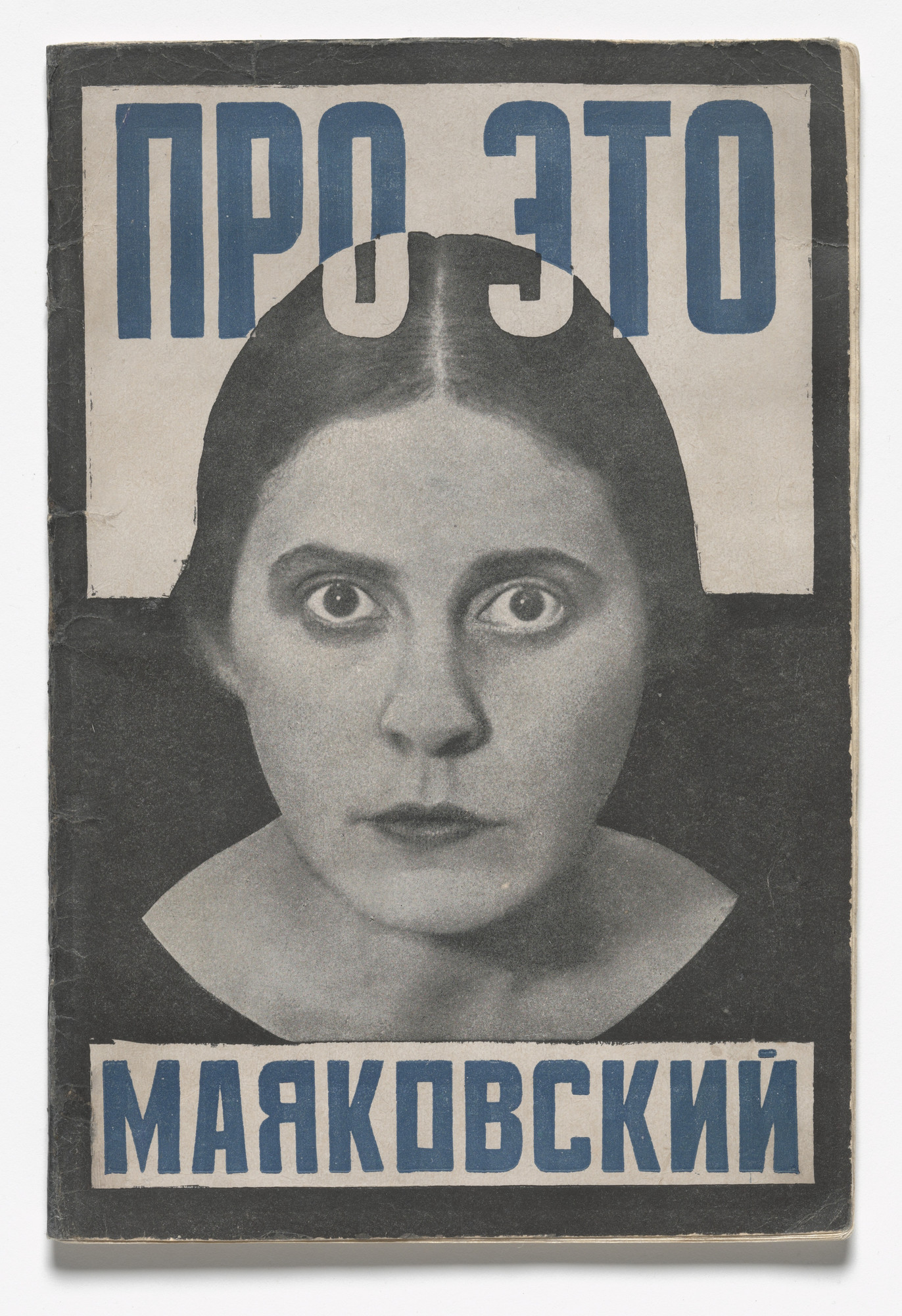
- Pro Eto. Ei i Mne (About This. To Her and to Me) 1923
- When I see this poster, I feel compelled to do something
- The woman's gaze and just a bit of her collar is showing making her look like a bust
- When the words touch her hair, they turn into a different colour, meaning the message must be damn important
- This poster was about denouncing the private agriculture sectors set up to help the economy, and since The Soviet Rep was communist, the people gotta know who's the real enemy here
- there are three colours: black, white and prussian blue (sophisticated)
- the background is split into two around the woman's ear, white on top and black bottom the words are primarily in blue, the bottom ones are contained in a white box
- There is a thick black outline that is visible only on the white side
- I think Rodchenko achieves the unifying the effect by having the black outline melt into the bottom half, and the bottom text box is similar to the top
- KATHERINE HAMMET
- ok so she got famous for her blocky and big letters on clothes, that were conveniently wore by famous musicians and celebs (Frankie goes to Hollywood)
- It wasn't really that hard to wear catchy shirts with big words on them
- Maybe it was revolutionary back then (1980's), that just means people back then didn't know much about text
- Not a big fan of her, but the reason why her shirt are so catchy could be because she keeps herself updated with current events, then come up with some aesthetically pleasing text to go with her perspective
- really really smart way to earn money
- Aside from his Worker Suit, I learnt that Rodchenko could be one of the first designers
- MYOUNG HO LEE
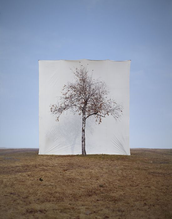
- In Tree, Lee "separates subjects from their original circumstances to derange the difference between subject and image"
- Juxtaposing solid white backgrounds behind trees to make it seem out of place was kinda my group's idea today
- Sometimes, the simplest approach to alienating something is to remove it from its background
Site Specific + Lost Letters
Good and bad design are everywhere. On my sketchbook I dissected a few pages from some magazines that caught my attention.
The first picture is the burnt Iraqi man from A+ magazine (article was about ethics in photojournalism)
- Picture made me feel queasy
- matching colours for his skin and bed sheet (which is unsettling because it's magenta)
- the light illuminates enough to see the anguish in the guys face
- which is twisted, unnatural position
A rioter being swarmed by police in a protest in Brazil
- It makes me feel sorry for the protester
- all figures are covered up, the black figures taking down the "lone hero", as seen from his bright red bag
- his limbs are all flexed and straight, putting up a valiant effort
Here I broke down what exactly Grizzly's new album cover meant to me
- most covers these days are used to facilitate sales, I honestly see nothing artistic about this piece
- So this is when I read why exactly are there album covers, and well, they "[create]a world for a particular album." (http://humanhuman.com/articles/the-importance-of-album-artwork)
- For me this cover, being so abysmally boring, really shines a light on how people buy music
- in physics it's true that light reaches you before sound, well that also means we see the album art before we listen to it
- music's important, but the art is also important for debuts, or reeling in new people
Wow this ad is so beautiful that I googled what exactly is an Art Pass and how to get it
- Basically it has a unifying feel to it
- Hepher's artwork shares similar colours with the card, and both are squarish
- the _ from the logo ties the text to the card
- the eyes naturally flows down the page
Breaking down and analysing is something we all do everyday, it's just another step to actually document them and remember their techniques. Graphics is really cool because the greatest illustrator doesn't hide his work from anybody--it exists in the public domain. If we just see enough of it, understand what it means, then maybe we can make good posters too?
Southbank walk+ Design Museum
Modified Social Benches, Jeppe Hein
Before, benches were objects we could sit or sleep on. Benches also has this social aspect of it, like obviously your butt won't take up all of it so other people can share it. Hein wants us to remember that benches have this special ability to allow people to congregate, and what better to do that by taking it away? This is simple and effective, but personally I don't really care about this piece of art, just thought it's kinda weird that theres an orange bench in the middle of the road.

Sam Durant's "Like, Man, I'm Tired of Waiting" was taken from a protest in 1963 about the American Civil Rights Movement. A humorous approach to something super serious, Durant's poster was installed in 2002, and now removed from its original meaning, it could be applied to everyday things. A huge handwritten note like this tells the audience that it's not super serious the message, and nowadays, it just serves like a popular backdrop for people taking photos.

Morag Myerscough's Designer Maker User wall, and Sheffield Children's Hospital
Morag is behind Studio Myerscough, known for its big bold words and also colourful designs. In The Design Museum her team set up the wall that shifts from word to word.
- Originally I thought anybody could really come up with big bold words and little triangles behind it
- Then I read about her other works like Sheffield Hospital, how she had to consider using plastic laminate for the surfaces, make it lively by making spaces that hid the machines and so on, I realised a designer is more than just a designer
- The term designer is misleading, it's really a multitude of other jobs, in Myerscough's case it's also maker, and ultimately being a user
- Making a space that is traditionally very cold to a livelier place

Vignelli made the NYC subway map in 1972, Henry Charles Beck made the London Underground map in 1931, and this modern Singapore map that nobody wants to own up
- It was a bold decision to make underground maps in these manners
- simplicity and ease of navigation took over accuracy
- bright fruity colours and fat little tubes are used
- basic geographical features are included to give some context(though Beck originally did not include Thames)
- We gotta understand the intent of having a train map
- people arrive at the station knowing where to go, but not how
- it doesn't matter how far between each station is, people need to know where to switch lines and the best way to do it
Graphics really misleading because it covers more than just designing, I wished I had more time this week to fully explore the realms of graphic communication.
WEAR IT
So today I learnt that simply by feeling and interacting a material counts as a primary research, and secondary is like reading about the material.
BENJAMIN JOHN HALL, LAZARUS WEDGE
I now know more about catwalk fashion, like specifically objects wore solely on the catwalk. Hall's Lazarus Wedge shoe has to get the attention in a short span of time (similar to a mayfly's lifespan really), and he does it by using fire with the shoe. Commonly people associate fire with destruction, Hall uses it to shrink the material and reveal its true form, like how phoenix rises from the ashes (his theme was rebirth and stuff).
SHAUN LEANE FOR ALEXANDER MCQUEEN, CATWALK JEWELLERY
Leane provides another example of the short lifespans of catwalk jewellery. Like the shoe, the focal point of each subject is the jewellery. Both Leane and Hall challenges how we wear our stuff on the body. That's not to say everybody should be wearing fire shoes and metal gauntlets now, but they provide narrative and accentuate parts of the body where traditionally they are neglected. What we briefed about catwalk fashion today made me see it in a different light--before this I thought who would wanna wear trashbags and all these outrageous things? But now I know it's obviously not to be worn as clothes, but are canvases with the purpose to provoke a response from the audience. The designers have this intent and theme they want to explore with their works, but ultimately the show needs to have memorable bits, and to put it bluntly the audience needs to be entertained and wowed.
SCOLD'S BRIDLE/BRANKS
Which brings me now to my own interpretation for today's assignment....the branks! I was going with the idea of surround and support, then I remembered that people used to wear these things as punishments. My original intent was also to provoke the audience with my more grotesque version of the bridle, one with a c-press like device that can squeeze the temple of the head. Then I realised I had to make it out of paper.
.
SINGAPORE ARMED FORCES, INTEGRATED LOAD BEARING VEST (ILBV) === > EXPLORING CARDBOARD PAPER
Cardboard paper is
- malleable and sturdy
- since it was rolled up, I used its curvature and cut with the grain of the paper to get the vest to surround the body
- it has good adhesive qualities due to its textured surface
I wanted to bring over something that was reserved only for the military for civilian usage; the MOLLE (modular lightweight load-carrying equipment) and PALS (pouch attachment ladder system) are both highly customisable aspects of functional protective wear. I took inspiration from my previous experience of using my ILBV then created a mock up version that explores cardboard's ability to respond to the shape. Although it did surround the body, it is quite uncomfortable to wear as the paper is hard and flat.
USE IT
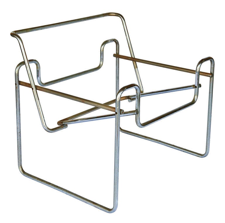

Marcel Breuer Model B3 Chair, 1925-1926
I decided to focus on chairs made during when Bauhaus was still in operation. It was an explosion in combining art with industrial products-- what we call design today. The head of the school, Gropius, banded together like-minded artists and cultivated the idea of combined craft with art. I'm drawn to this idea because it was a pivotal turn in design history, and it was vastly different from all concepts previous to this.
For the chairs specifically, I'm interested in:
- how they all stem from a geometric shape then grow from it (squares)
- the very clear and linear quality of armrest and legs
- angled surfaces for the body to rest on, basically challenging how the body can sit on it
- exploring different and new materials to use
Breuer's chair
- The body rests on the fabric that is bound by parallel rods that are also symmetrical
- Nowadays this idea is widely copied, but Breuer did it way back then and it caused quite a stir
- It has a very collapsible feel
- I could adapt this design and make future chairs that are collapsable with hollow steel tubes
- I never been on this chair before, but previous experiences with chairs with suspended fabric:
- makes noises when people adjust on it (not very pleasant)
- people cannot rock it chair
- the angle of the seat is acute, so like users would need to lean forward to sit upright
- if the fabric are sewn together, it would be difficult to wash

Willem H.Gipsen Diagonaalstoel , 1930s
- Visually similar to B3, this is a further reduction on materials and complexity of lines
- I found it interesting that Gipsen decided to have armrests stem out from the backrest
- The user would be in an awkward position as the rests are quite thin
- From this chair, I believe armrests for chairs should be reserved for chairs that has more mass, or like volume to it
- it wouldn't make much sense for chairs that are light and portable to have armrests, since most likely they are used in places where people just stay for a short moment
- It looks decent, but this chair isn't practical, it's a conflict between function and comfort

Josef Alber The Club Chair, 1928
Alber designed this while he was furniture director of Bauhaus, and aside from the fact that it resembles the linear and geometric qualities of previous chairs, it has padding
- Padding adds the volume and weight that Gipsen lacked for the armrest
- It has an angled seat like Breuer's, and both of them are attached to the armrest
- Alber combined both legs and armrest by making them into a square, and the seat is sandwiched between these two hollow and sturdy structures
- Although the materials are not as futuristic as the rest, Alber's chair has a sturdy quality to it and all materials work in unison
- It's solid wood makes it more of a chair for relaxing, hence the club chair
- Aesthetic-wise, the chair between the two simple squares, almost like being squeezed from the two square
It is interesting that such an important school was eventually closed down for being too modern (to put it simply). The fact that we have talented and creative people creating objects for the common folk, something so noble, is shunned by the government back then (Nazi) is quite shocking. It really comes to show how even an elegantly designed mug could have politics related to it: was the institution behind it approved by the government, the designers background, or even where the materials were sourced. Bauhaus is really a treasure trove of art, and art's relationship with other subjects.
Don Chadwick and Bill Stumpf, Aeron Chair, 1994
Behold the office chair that started the lumbar support craze...Isn't it interesting to take good design for granted? We use objects that have been refined over and over again, so when I first saw this Aeron chair I didn't register it as anything significant. But when I read about it, then well I guess it was something pretty big.
- It is hard to separate the marketing terms from the real design aspects
- the pellicle (their term for the fabric) differs from the upholstery previous chairs used before, it ventilates and is transparent
- The screen-like material allows people to see the skeleton of the chair, the real reason why it's so comfy
- the new pellicle replaces the usual foam, and that helps the environment
- This chair made me realise that I take good design for granted. I didn't recognise that this common chair now was such a big thing in 2000's.
- What I call simple or normal didn't exist a few decades back
- Design is still new, and there must still be quite a lot of aspects of it we didn't explore
- the pellicle (their term for the fabric) differs from the upholstery previous chairs used before, it ventilates and is transparent
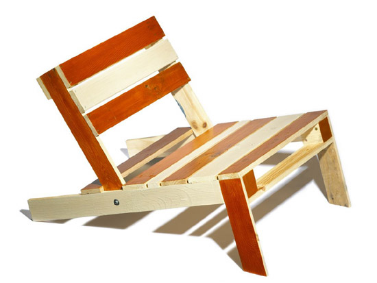

Nina Toltrup, Pallet Chair, 2010 Thomas Lee, Adirondack Chair, 1904
Toltrup created a range of furniture using wooden pallets. It was part of the Pallet Project that started in 2008 and invited people to create furniture that was £10 or less. The instructions were all available online. Toltrup took practically and availability to the extreme--she basically separated the tush from the ground in the simplest way. Similarly Lee sought out to create a simple chair for his family, and using only 11 planks of wood he made the Adirondack, which is now associated with summer time in America.
- Both chairs' seat are angled because of the rear legs
- Lee created for comfort and simplicity, whereas Toltrup reduced everything to its minimum
This goes back art and social effects, just by setting up a charity by selling Toltrup's chairs, she makes people realise that some people's lives have not been touched by design. Sure some people living in developing or under developed countries have devised ways to get by, but I believe a cleverly designed product is universally appreciated. In other words, anybody can recognise a product that just works, better yet people can also break it down and analyse why it works. By incorporating simple and elegant designs to people who are not used to seeing good design can spur their desire to create better products.
On the day this class was taught I was sick, so I read the brief and created my own chairs.
- I created the chair on the right first, I realised that cardboard isn't a good material for miniature objects because it has the wafer thing inside that prevents precision bending
- The idea behind was to create a chair that surrounds and provide just enough shape for the body, hence the nose shape
- For the barstool I wanted to create something familiar yet more comfortable than the usual stool
- The little area that dangles from the seat gives a tactile response for the legs--a little reminder that legs are dangling
- Backrest supports the lumbar and is the only necessary bit
BUILD IT
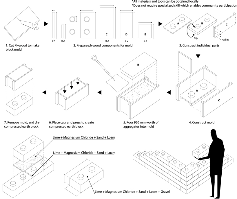
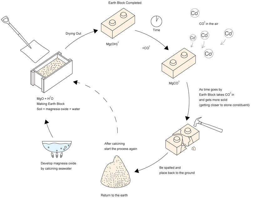
Yasuhiro Yamashita, Earth Bricks (Chiba Prefecture) 2011
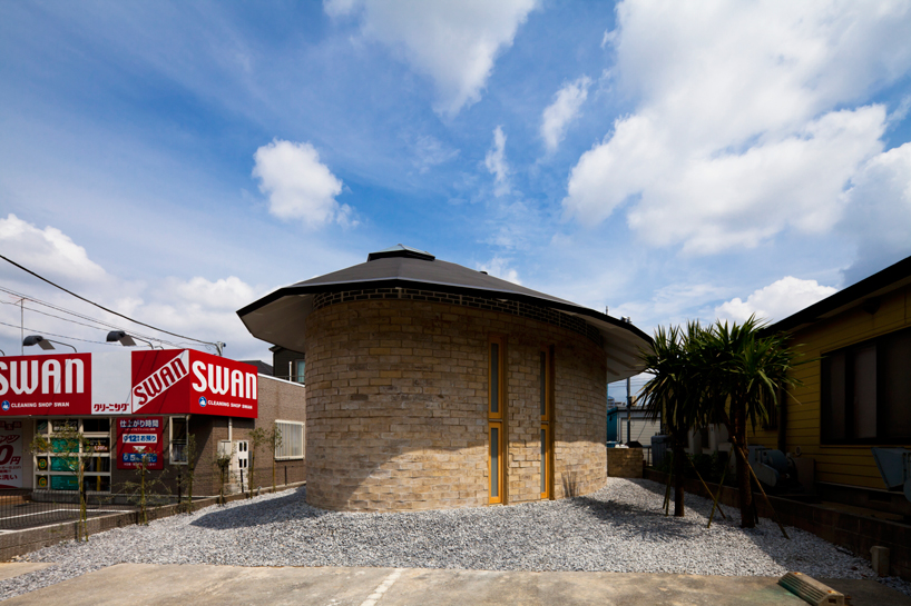
- A seemingly small house, Yamashita is known for working with limited space
- Japanese houses are particularly interesting for their design and material usage
- The houses need to withstand earthquakes
- Island nation means limited access to certain building materials
- High population density mean most people can only afford to live in smaller spaces (Chiba is pretty ok
- Yamashita designs buildings that makes people wonder about the interior

- The vaulted ceilings provides lighting that can be seen on the exterior of the building
- The walls are made out of special bricks that can be sourced locally and is environmentally friendly
- This is the practical aspect of Yamashita's project, aesthetically it's nothing groundbreaking, the materials for brick can be found anywhere and it actually strengthens over time as it's exposed to the atmosphere.
- Earth Brick is a demonstration for the "lego-ness" of these bricks, and it's an excellent way to showcase new materials
- Shows how lack of materials isn't a bad thing
Lucky Drops, 2005, Tokyo


- Interiority plays a major factor, residents need to feel they have proper space to live in
- Yamashita takes advantage of the 29.3m length and places most of the living spaces underground
- The all glass exterior allows light to penetrate all levels of the building, so the residents don't become moles
- The boat shaped building makes the building look bigger, compared to if the building was a rectangle, the narrowness would be more evident
- this is interesting because curved edges masks the actual volume of the building (geodesic domes)
- I could use this concept in the future for buildings, products or even clothing design

- Steel and glass were the main materials in construction
- Provides strength even the walls are narrow (both glass and steel)
- Challenges where people live, in this case due to space restrictions Yamashita placed his residents in the basement
- Living underground obviously saves space and doesn't block as much sunlight as traditional upright buildings
- I can see why people detest living underground, like how the air is stuffy, if everything collapses, or claustrophobic people
- Maybe living underground is the key to the sustainable living? (less insulation needed, better space management, more area for green stuff to grow!)
IVAN JUAREZ Forest Refuge
- Juarez blurs the line between architect, landscape designer, and even a sculptor
- Forest Refuge is the link between the environment and man
- It deals with form, and what exactly is the difference between a sculpture and a building
- a building just needs to house a person
- a sculpture doesn't need to house people, but it just needs to take up space
- In this case, I think it would classify as an installation (sculpture) because buildings need to provide shelter and other means for its resident to continue to live (like space for meal preparation or sleep)
- Juarez could also be asking, "are we living in art? Could the spaces we live in also classify as art?"
Multisensory Park, San Luis Potosi Mexico
- "The intervention addresses the relationship between site, perceptions, experiences and senses. A landscape intervention dedicated to 'sensing the landscape'. An interventions that connects and approaches with nature."- XStudio, Ivan Juarez http://www.x-studio.tv/projects/landscape-city/multisensory-park/
- In other words, Juarez analysed what it truly meant to be in the park and made it even more:
- rings around a tree give the blind a sense of space between each tree, possibly giving them some mental image of a park
- information boards with Braille, trees with holes and sticks so birds can perch and sing allows a more tactile response
- Juarez still deals with space here, just like any architect
- main difference here is the site and method
- site wise, instead of an empty block he uses the park
- instead of adding new structures, he modifies the surroundings to make it more inclusive

College of Architects Building, San Luis Potosi
(Antonio Cardenas Gorab, Juan Manuel Lozano de Poo and Manuel Márquez)
- More conventional approach to being an architect
- an example of function and form being as one:
- overlapping prisms that make up the building provides an open space in the centre, a space for congregation
- local materials that suit the climate (bricks and certain open spaces)
- a stair and slope combo not only works well, but compliments the sharp edges of the different compartments of the building


NICHOLAS GRIMSHAW, Eden Project, 2000
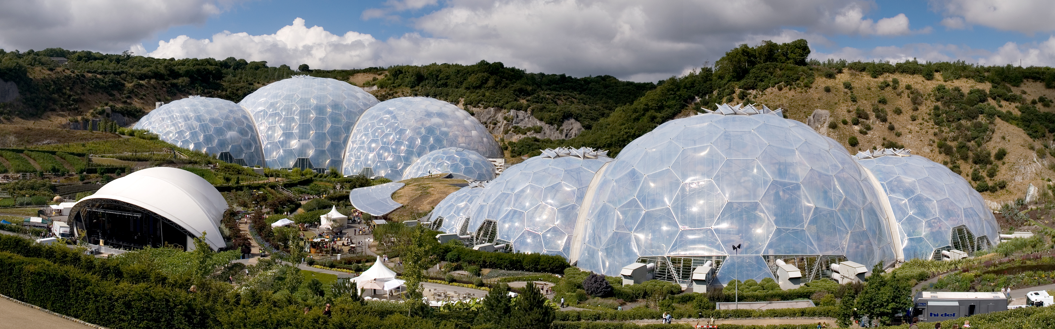
- Inspired by Buckminister Fuller's geodesic domes Grimshaw made some domez... why?
- you see the domes uses the least amount of weight and materials for a very sturdy structure
- it also provides the most volume for the materials used, thats why it makes sense to use them for greenhouses
- To make it even lighter Grimshaw used ethylene tetrafluoroethylene (ETFE), a type of plastic that is also resistant to UV light, lengthening its longevity
Waterloo International Station, 1993

- Grimshaw applying the geodesic shape to form arches of a train station
- Because this is an arch and not a dome, there is need for additional interior skeleton that geodesic buildings do not
- The translucent glazing allows the station to be lit during day, and the surroundings to be lit at night
- An arch makes people realise the space it occupies, a high and curved ceiling gives a sense of space
- Goes back to Yamashita's idea of using curved lines to make spaces bigger than they are
JIM EYRE, CHRIS WILKINSON, Gardens by the Bay, 2012
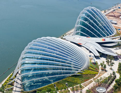

- Somewhat of a national icon now, Singapore's Gardens by the Bay is a big space with lots of plants growing in lots of different places (to put it simply)
- Fuller and Grimshaw's projects reminded me of home, specifically the Cloud Forest and Flower Dome
- There's something between plants and domeish things I realised...
- no internal structures for a dome, which means less shadows and more view
- less surface area to maintain the temperature, in Cloud Forest the temperature is lower than outside, so less electricity is used to maintain the internal temperature
- even though there's no earthquake or natural disasters in Singapore, a dome is also quite strong for its size
MORE ON INTERIORITY
Justice Centre, Portland, Oregon 1983 . (Glass designed by Ed Carpenter)
- Interiority is the feeling of being inside a building, and when you have a 9m arched window allowing colours and lights from outside in, it can really feel confusing
- The outside world is basically captured by textured glass and then transmitted into the lobby, creating this sense of "indoors yet outside" feeling
- Ed Carpenter believes that "Glass design should serve, and take its tone from, the architecture" (Moor, Architectural Glass)
- Glass was only really part of a building, and not just an ornament, quite recently, and nowadays it has become an important part of the building.
- Gropius or Wright might have pioneered the large scale use of glass in their buildings, but what exactly was the push from just stained glass to walls?
Moor, Andrew. Architectural Glass: a Guide for Design Professionals. Whitney Library of Design, 1989.
Lastly, CEDRIC PRICE'S THINKBELT

- long story short, Price wants to use this vast plot of land for a hi-tech school
- he believed that buildings needed to be adaptable because no one knows how spaces can be used in the future
- What I want to say is that although this is a visualisation, Price is just suggesting where spaces could be, and not like blueprinting everything
- He is drawing just enough to get an idea of how this school is on literally on the rails, the scale of people and where things should be
- Which is weird because I thought all visualisations must be 100% correct
I covered a lot of material today, and that was just things relating to the research. Architecture, like graphic communication are both misleading; they cover so much more topics then what they are usually portrayed as having.
Your Surroundings
ISSEY MIYAKE (b.1938)
Miyake is known for his innovative clothing, textile materials, and his pleats. In addition, he "forms garments that celebrate the vitality and movement of the human body...overlaying them with the dictates of couture tailoring to communicate a liberated global aesthetic". (Cruz) In other words, he experiments with innovative textiles and pleats "to produce adaptable clothing that is both functional and reflective of modern simplicity in an egalitarian society" (English 12).

A-POC 1998
A Piece of Cloth is revolutionary because it's a tube of stretch jersey created from a single thread that can be worn by cutting out a shape. Both art and functional, Miyake is creating dialogue between clothing and the user.
Due to his innovative nature, A-POC also had this performance aspect to it. In the 2006 Milan Furniture fair Miyake worked with Ron Arad to modify Arad's Ripple Chair. The result was called Gemini, a vest or a body-seat cushion.

Pleats, Please (1993)
P.P was a range of 200-300 garments where Miyake combined synthetic fabrics with his pleating style to create clothes for dancers. He analysed bodies in motion from William Forsythe's Frankfurt Ballet and wanted his clothes to move where the body moved (English 12). The Coloumbe dress (1991) above was not from the P.P series, but it demonstrates the innovative ways of folding fabric, the technology (it was cut using heat) and to celebrate the human body.
YOHJI YAMAMOTO (b. 1943) and REI KAWAKUBO (b.1942)


Yamamoto Fall/Winter 1981 Kawakubo Dress meets Body 1997
I grouped Yamamoto and Kawakubo together because thematically they are similar. As much as both designers protest against their roots, there is a clear division between East and West fashion back then. In 1981 when both designers had their show in Paris, they wanted to make it clear that "sexuality is never overt", and accentuation of contours of the body is for the amusement of men (Salazar 54). Both designers shocked the audience by presenting seemingly unstructured, and black clothes, in comparison the Western designers presented a form of femininity that is sexualised. Basically what they did was show up in Paris and redefined what fashion is. Similar to Miyake, Yamamoto and Kawakubo pay attention to the fabric on the body, specifically how it embodies the fabric. In other words, clothes that embraces and shows off the fabric. However, what is different between Miyake with Yamamoto and Kawakubo is their emphasis on wabi-sabi, how imperfection like wear and tear, distortions are beautiful.
Vionnet (b. 1876)
Liberated women from corsets, used bias cut to allow fabric's "elasticity...to follow the curves of the body" and proving that "material falling freely on an uncoreseted body was the most harmonious of spectacles" (Kamitsis 11), Vionnet did all that way back in the early 1900's. Using the ancient Greek peplos as an inspiration, simplicity and the female body was all Vionnet cared about.

Sonia, the leading model of the house 1931. Vionnet's achievements can be summarised as:
- popularised bias cut (not invented), cutting diagonally of the grain so the dress clings and moves with the wearer (blog.colettehq.com)
- decorative seams, visible seams, and made dresses without fasteners (easier to take out)
Balenciaga (b.1895)
Altered the female silhouette around 1950's. A tailor himself, he created garments that were fluid and altered the female body (similar to Yamamoto) whilst infusing Spanish culture. Famous for sack dress and square coat, he never made his clothes pret a porter, instead he relies on wealthy people to buy individual garments from him.


Alberta Tiburzi in "envelope dress" (sack dress) 1967 Lisa Fonssagrives in a square coat 1950
Christian Dior (b. 1905)
He didn't go against femininity and opulence like the previous designers, instead, he embraced it and yet changed how women looked (www.metmuseum.org). In his 1947 New Look collection he rejuvenated Paris as a fashion icon. He made clothes that accentuate femininity by padding the waist to make hips smaller, and made the shoulders more prominent.


Spring 1947 New Look A-Line, 1955
CONCLUSION:
Even though I might not head into fashion, I can appreciate these garments from a 3D perspective. Structurally, Yamamoto and Kawakubo deviates from the body most:
- their clothing are mostly androgynous, or distorted
- a vessel for a purpose other than looking and feeling good
- sure, Y3 might be a pret a porter, but Yamamoto and Kawakubo's real intent for designing lies beyond what people would wear for their daily lives
What fashion does that sculpture or any 3D pathways don't deal is the fabric; the closest sculpture could get is varying materials. Take Miyake for example, the process of pleating his garments is already arduous enough, now combine that with how the fibre is made before pleating...Sculpture can never reach that level of detail!
I believe fashion adds a new dimension in viewing anything 3D; it is essentially a sculpture within a sculpture that moves, except everybody knows what the inner sculpture looks like and we are just interested in the silhouette. Fashion has ways to describe what sculpture simply calls form. For example, silhouette comprises of form, volume and even contrast. Yamamoto's asymmetry and drapped clothes from his 1981 show might share the same colour and volume as Balenciaga's sack dress, however it is ultimately the silhouette that separates them apart.
What I'll do with all this knowledge I don't know. Technically I cannot translate what I learnt from these famous figures into anything I do now. Conceptually however it did provide me a new way to view garments and sculptures in a new light.
Charleston, Beth Duncuff. Based on original work by Harold Koda. “Christian Dior (1905–1957).” In Heilbrunn Timeline of Art History. New York: The Metropolitan Museum of Art, 2000–. http://www.metmuseum.org/toah/hd/dior/hd_dior.htm (October 2004)
Da Cruz, Elyssa. “Miyake, Kawakubo, and Yamamoto: Japanese Fashion in the Twentieth Century.” In Heilbrunn Timeline of Art History. New York: The Metropolitan Museum of Art, 2000–. http://www.metmuseum.org/toah/hd/jafa/hd_jafa.htm (October 2004)
DATA+INTERPRETATION
Anne Wilson (Beauty in varying lines)

A Hand Well Trained, 2017, hair, cloth and thread
"Found cloth and human hair have been my sources for material drawings for over 25 years. Cloth comes to me from all sides of my family. Some of the cloth travelled with family members who were refugees from Romania during WWII. Some of the cloth is from my Quaker and Canadian ancestors. My materials range from these heirlooms to more everyday found cloth, like commercially produced motel sheets, pillowcases, and restaurant cloth" -- Anne Wilson from www.annewilsonartist.com
- Demonstrates these things:
- uses materials that form her identity
- simple lines of varying thickness that are bold and hold the fabric up (has a purpose)
- As far as textile goes, the different pieces of fabric are all similar in colour
- different bits have different texture to it, like how it absorbs light or how thick the black thread to support it
Normally stitching is joining together fabric to be worn, but Wilson joins them up to shed some light on her background. Stitching itself is sufficient to hold some aesthetically value, and Wilson demonstrates it. Wilson here shows that even its entirely another medium (from paper), bold lines do look good.
Chiaru Shiota (Organised chaotic enclosures)

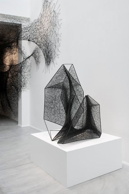
Sleeping is like Death 2016, thread, bed (this is an exhibition plus installation)
- Shiota uses intricate woven fabrics to create spaces for people, and to materialise her mental ideas
- The fabric can be seen as black entities invading , however it actually creates the space
- we just associate it as being evil because it's black, meshy and dims the light
- It's interesting to see how because it looks like web we associate it with something evil
- Through thread, Shiota shows the audience what is happening inside her mind, even to the point of being inside it
- It's a strong effect to allow people to walk inside your mind, the concept of being inside somebody's mind
- Shiota did some pretty cool things with thread, but what's cooler is her use of installations
- normally installations are just big sculptures, Shiota uses the fact that you have to walk inside one to get the message across
- Shiota reminds us that the viewer's presence also affects the message
- I could use this concept of installation in my future projects
Olu Amoda (environment's effect on materials)
Concrete Lab Door to Yaba College of Technology, 1995
Nigeria's "rate of everyday crimes such as theft, burglary... has increased dramatically during the last couple of decades" (Newell, 43). With that in mind, local metalsmith Olu Amoda infuses art and practicality by making burglarproof gates. Amoda uses scraps of metal found on the streets and other everyday objects to create his gates. Amoda's resourceability and the subject he creates reflect the environment that he is in. Sometimes the material and context tells a bigger story than the actual piece itself.
Newell, Laurie Britton. Out of the Ordinary: Spectacular Craft. V & A, 2007
FINE ARTS
UNPACKING MUSEUM TRIP:
Collection, to put it simply is pluralising something. We can impose rules on what and how things are gathered. However, I argue that a collection must have purpose, more importantly the creator must be aware that he/she/it/they/whatever is making a collection.
(Analysing only through the collection)
In White Cube there are two artists who demonstrated what a collection looks like.
Ann Veronica Janessen uses multiple objects and "minimal sculpture" to "[explore the] spatio-temporal experience and the limits of perception". Ok so basically themes that deal with visual manifestations of time and decay and all the usual "I'm an accomplished artist and I deal with meta physics" things. This space includes the " 'Dichroic Projection' [the coloured lights] ...[that] exposes how different coloured lights can create charged atmospheres, specific perceptual effects or psychological moods" and also the the "Aquarium" that "[exposes] optical or spatial contexts and shift perceptual understanding" by constructing a cube with multiple mirrors and coloured paraffin oil.
Firstly, this is a collection all right albeit an extremely boring and tiring one. Her "rule" is that all her works explore time and perception, visually her works take on various forms though all of them are sculptures. To a certain extend she recontextualised the halogen lamp; instead of illuminating she delves into "perceptual experience wherein this materiality is made unstable" (I'm not going to translate any of that).
It's quite obvious I didn't like this exhibition at all. What fuelled my frustration and confusion was that her theme was way above what I can comprehend. I left feeling inadequate and dumb, and it made me reflect whether I should level up to appreciate this, or simply say "I don't like this".
Breaking it down, I feel her works feel scattered and lack a focal point. Unlike Shiota, her installations wasn't utilised effectively to bring out her message. Everything felt like a diorama, where each corner or section of the space has its own activity.
http://whitecube.com/exhibitions/ann_veronica_janssens_inside_the_white_cube_2017/
The other exhibition in White Cube was actually recommended by the tutor, as a component of it deals with data collection.
Damian Oretga "Play Time" explores themes like aesthetics, game play, chance, and culture.
Collection in this exhibit means:
- numerous visually or conceptually objects that belong as a group
- gathered data posters that are juxtaposed with "visual essays"
Genealogy of Anything is the series that the concrete mould of the styrofoam packaging. From a collectivist view, Oretga connects the objects together by materialising the positive and negative space. Arrangement wise, both sides of the mould seem to be accelerating from the centre (kind of like the rapidly expanding universe), thus having this narrative feel to it.
Data collection? Well his posters, on the surface level, deal with the impression of collecting data (cosmology or diagram). Second glance however, he took out all the quantitative bits and replaced them with words. His visual essays deal with the demise of democratic order and other philosophic stuff.
Lastly, in his "Coliseum: Diagram of Time" each block represents 5 minutes within the total 90 minutes of a football game. The way it's organised invites audience members to step inside and view it from the inside. Undeniably, you are going to feel like Godzilla in a stadium and that's all because of the repetition and size and the glazed clay sculptures. It's interesting that simply the arrangement of the sculpture can alter ones scale.
To summerise, both artists took a super different approach to what collection means. Traditionally there's On Tawara's Today series that explores how to interpret time. Everyday Tawara would paint the date over a monochromatic background, along with a snippet of that day's news in whatever city he is in.
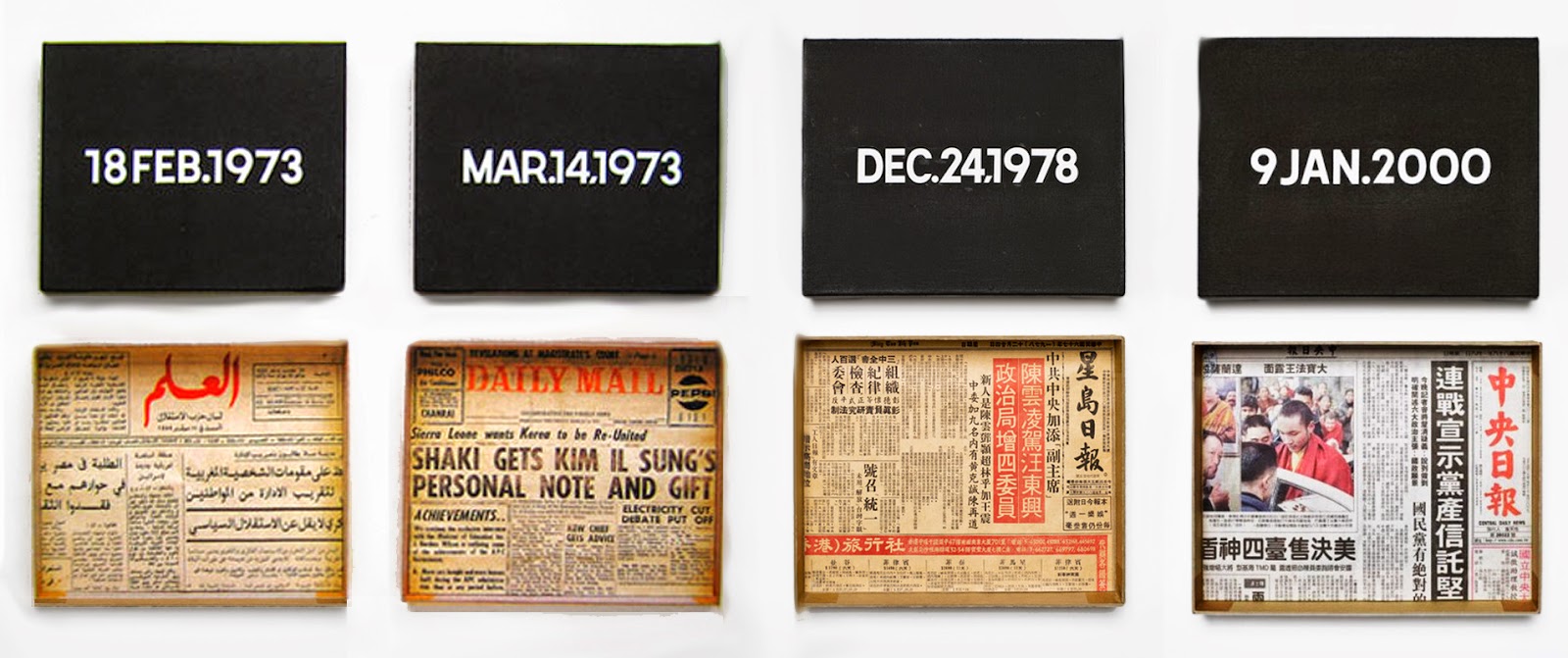
On Tawara, Today (1966~)
This case is special, because it's actually the curators who organise and present them as a collection, and not Tawara himself. To give his works context, curators present them formally--it accentuates the lineage and also narrative aspect of the piece.
(https://www.creativeboom.com/inspiration/its-play-time-with-damin-ortega-at-bermondseys-white-cube/)
(http://whitecube.com/exhibitions/damian_ortega_bermondsey_2017/)
Collection is a tool, medium and method:
- tool in a sense of generating ideas or actually making the work
- medium as how they can be arranged and presented
- getting other pieces of work to interact with one another, a method of reinforcing an idea or theme
FINE ART LAST DAY
You know, whenever I write something for workflow there are always pages of handwritten notes written prior to typing. Instead of just tossing them away why not put it here? It's the exact same thing and it saves me lots of time. The paper breaks down the themes of the piece, and below I'll write about their influences.
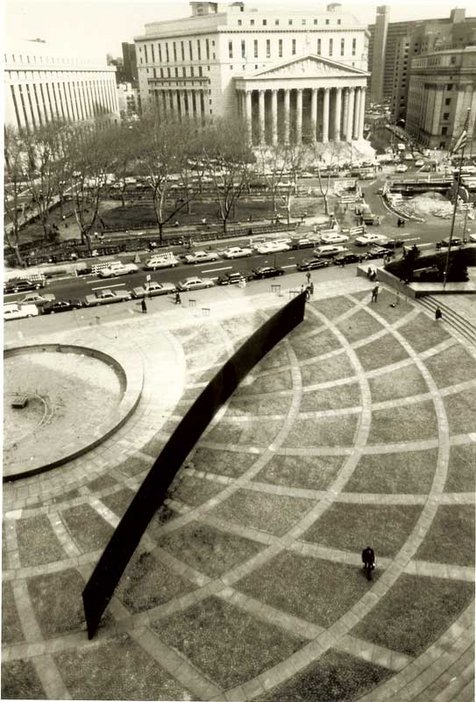
RICHARD SERRA, TILTED ARC (1981)
- Yup this piece, to be honest maybe it was always subconsciously fuelling me to create works that provoke other people (I did researched it a long time ago). You can't get anymore blunt with this piece, seriously having a huge metallic wall that block those busy New Yorkers, that's insertion with a capital "I". However, Serra did say the piece died when it was uprooted, something I feel that's a bit contradictory...
- Serra placed this wall to force it into the lives of daily commuters
- The authorities wanted to relocate it but Serra say it dies when its out of its habitat
- The concept of participatory art lives on, the story of its sad struggle of existence is actually stronger than it being there
- In other words, its removal cemented the idea of "in your face" art
- In your face can take many forms, Serra just struck the top of it
- Nowadays everybody wants to either get their opinion heard, inflame others, or just spew random nonsense.
- Serra in a way, predicted that in the future there will inevitably be "in your face"
- The very least we can do is propel some kind of good message...something REALLY GOOD
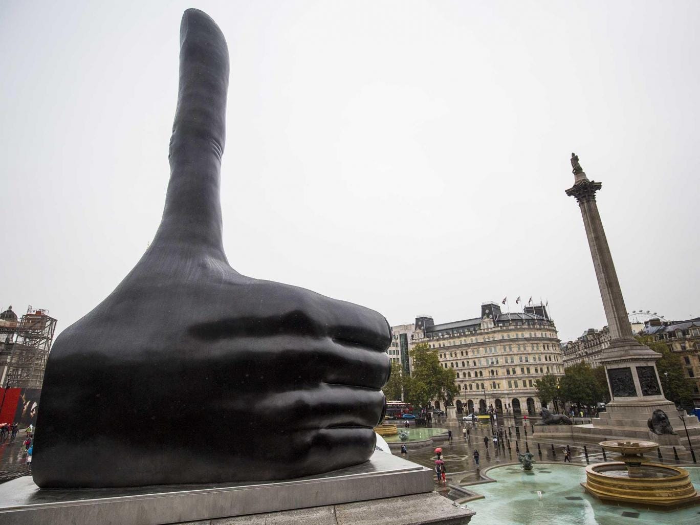
DAVID SHRIGLEY, REALLY GOOD (2016~)
- Ya know, these works I've researched are actually done after completing my Industrial Basketball piece. These works were recommended by my tutor because they were either interactive or just in your face.
- People can go on and on about their interpretations of his thumb, but honestly that's what so nice about this piece--it's so simple it's profound
- Compare this to Oretega or any of White Cube's artists (no offense), you brainwash the audience into blindly " admiring the heightened sensibility and ingenuity of such artists" (http://www.visual-art-research.com/2010/03/ping-pond-play/)
- No, great art by great artists don't deride its audience and belittling them into thinking they are a bunch of toddlers...
- Art is assessable, it needs to provoke and inspire people into being better versions of themselves

CARSTEN HOLLER, FRISBEE HOUSE (2000) THOMAS HIRSCHHORN, HOTEL DEMOCRACY (2003) GABRIEL OROZCO, PING POND TABLE (1998)
- All these works were featured in Tate's 2003 Common Wealth exhibition (exploring participants vs audience)
- Simply put, these works must be experienced physically to understand what it means
- Combine it with elements of fun, or force audience members to walk around and examine every little box...Works that more than just "gaze upon me" has this next level of conveying its message
Basically what I'm saying is that looking is good, but doing is better. In art, feeling charged from a piece of artwork is the result of the piece speaking to you. You can achieve this by either being "in your face" or interacting with the piece itself.
Sources:
http://www.culture24.org.uk/art/art18657
http://www.tate.org.uk/whats-on/tate-modern/exhibition/common-wealth/common-wealth-artists
https://www.designboom.com/art/thomas-hirschhorn-s-hotel-democracy-at-art-basel-2008/
http://www.tate.org.uk/context-comment/articles/turning-the-tables
http://www.visual-art-research.com/2010/03/ping-pond-play/
http://www.tate.org.uk/context-comment/articles/gallery-lost-art-richard-serra
http://www.theartstory.org/artist-serra-richard-artworks.htm#pnt_4
BABRI + ABP
Summary of the Barbican visit:
- Definition of art is getting blurrier; the line between what art is perceived as and not is getting harder to define
- THAT IS if you got all your needs settled and have the luxury to think about art
- You wouldn't consider the colour of the roof if you don't have a house, instead you would find how to build one
- People see art as a bourgeois activity because...well it's not necessary to sustain life
- Sure it's nice to forget about the world for a bit, or hold a cup that fits nicely in your hand
- But you wouldn't know any better if you never considered it before
- I create because I need to, because I find pleasure in creating objects that make people react to it
- Is that reason enough to say art is necessary? Because there are people in the world who just enjoy making things?
The making of Loving Vincent
Coming from a guy who doesn't know Van Gough well (or just any famous painters), I now know that he is famous because he painted through so much turmoil in his life. Now that's not the only reason why he is universally acclaimed and stuff, but I feel the strongest one is that his works "speak" to people. Personally I never encountered a piece of art (or anything) that made me drop dead, so it's difficult to understand how good art speaks to people.
John Akomfrah's Purple
By having 6 screens playing videos, Akomfrah is playing with how much we the audience can absorb. Normally artists expect you understand what's going on, or dumb it a little, but I think Akomfrah is intentionally playing with how much we see, like saying "How much you understand is up to you, you could sit here and rewatch every screen or whatever".
This is actually interaction with the audience
- multiple ways to investigate a piece, kinda invites us to explore them all (Hirschhorn's Hotel Democracy)
- instead of saying "this is the end guys, go home now", even at the "end" of one run people were hesitant to leave
- should we stay some more to watch?
- try to pick up whats going on?
- I call this constructive confuzzlement!
- due to the video's lack of narrative (linear, clear narrative), it's got the audience kinda scrambling for meaning
- through confuzzlement the audience makes all these connections that explain what is going on
- Akomfrah occasionally inserts some obvious messages to steer us the right way (basically be green)
What's probably my biggest take away is Akomfrah isn't pointing any fingers. He doesn't explicitly say hey audience be vegan or something, instead he is saying collectively as a result of progression we are poisoning ourselves and the environment. Which is all a breath of fresh air, because I'm tired of the usual go green slogans, trying to guilt trip people into eating tofu all day.
BRUTALIST ARCHITECTURE!
It was that super sandy day when I visited the Barbican, so everything was orange (and I loved it). Honestly I enjoyed being inside the estate, more than appreciating the works being shown because it's all so beautiful.
I'm not sure why I felt that way...But these did made me feel even better
- I went and touched the unrefined concrete surfaces (beton brut)
- There is a stark contrast between "living" and "community" spaces
- The colours were all muted and limited, everything was stark and rather gloomy
The firm Chamberlin, Powell & Bon unified materials with the design of the buildings to create something that wasn't only visually unprecedented, but conceptually successful (Robert Owen built his utopian socialist hamlet thingy, but it failed in the end).
Ok let's start with some facts:
- Post WWII Britain, lots of pits due to the Blitz, the government has this huge demand of houses
- Economy beginning to pick up the pace, not a lot of cash lying around
- People needed dem housez bad yo
And ta-da! the Barbican was born! Sure yes there similar developments that predates Barbican's inception (1955), but there were nothing as bold until it was opened on 1982. The estate was almost completely sustainable; it had art centres, schools, residential blocks, and most importantly space carved out for social interaction. Combine the need and the intent, and we can see the definition of Brutalism:
- Visually:
- Rough unfinished surfaces
- Massive slabs of concrete, heavy and almost intimidating scale
- Overtly displaying building's functions (service ducts, lifts, water towers...)
It's important that the creators were looking to create a "look", instead they were about the "feel"
- Conceptually:
- Modular approach to organisation; elements sharing similar functions are grouped together
- Compact, only take up what is needed approach to scale.
Habitat 67, Moshe Safdie, 1967 Hunstanton Secondary Modern School (Smithdon High School), Alice and Peter Smithson, 1954
- Safdie's 354 interlocking pre-fabricated blocks house a total of 158 units.
- It was actually his thesis for architecture programme at McGill, and it was crazy that he got the support to make it
- Protruding blocks overlapping each other create this beehive look, creating pathways on numerous levels connecting the whole premise, something like Smithson's streets in the sky concept
- Smithson couple's sec school glorified steel and and structure
- It was a bold testament in exposing the structure of a building
Autograph ABP, Zanaele Muholi
Ok, to make it super simple Muholi's exhibit is about race, yet she doesn't really add anything new into the dialogue. I say yet because race and promoting black culture and identity is something that is happening all the time, and actually social media is a better medium than her photo exhibition. Regarding her works, it's funny to see how she uses common objects to depict a certain group of stigmatised folks. For example, Bester V could be eluding to black servants, judging from the metal scouring pads.
Now I'm not against Muholi "reclaiming her blackness", but since she herself said that she that as a South African citizen she has responsibilities to help, maybe she could added something more interesting? This brings me to another point, I realised that to fully understand her works I needed to read the numerous magazines and books that were located around the exhibit.
Should works be readily understandable? Or should they be buried along with supplementary information? Yes, no shows can exist in a vacuum, but does the audience need to have additional information prior to visiting? To be honest I read a few books and mags and I felt all of them are about the same issue--stigmatisation against people of colour.
I believe good art gotta add something new and interesting to talk about, Muholi is doing something that we've seen a gazillon times on social media (and it has more of an effect on the web than confined in a gallery).
Reading week research
V&A:
- Something different from the rest, it's like a "lifestyle" museum spanning centuries
- Most memorable sections:
- Casting Courts
- Sculpture walkway
- Tapestry room
- Plywood exhibition
This sad lion (the saddest) belonged to a villa somewhere in France, which was a thing back then because wealthy people enjoyed having marble sculptures and pillars sprouting from their backyards. Most of the items on display in the V&A depicted the "lavish" lifestyle of Europeans when powdered wigs were a thing. From what I collected from the exhibits, I believe people living between the Medieval and Renaissance era based their lives on impressing others. Wealthy or poor alike would try their best to flaunt their wealth, either being a patron of the arts or having decorated villas. It wasn't enough to just be wealthy, you need to flaunt it around, and even to death. The casting courts and the sculpture walkway put things in perspective--it showed me what people were willing to pay immortalise themselves as wealthy people.
For example, tombstones similar to sarcophagus were often carved to depict the deceased sleeping, often with his/her partner. These coffins often came with an altar like roof, a little monument that houses the dead. At first I thought it was pretty absurd to have this obsession that everything must be "gilded", I mean even the spittoon is made from fine porcelain! But then they were a few centuries before the Industrial Revolution, and that meant most objects were made by hand. Guilds and skilled craftsmen were still a thing, and they are capable of creating insane embellishments, but most importantly the attention to each product.
Here is Bravery and Cowardice, and Justice with Deceit(?) its quite obvious who is winning here. To some extent art played a bigger role in the common folk's lives back then, compared to now. Sculptures depicting biblical scenes or virtues were common because of the high rate of illiteracy. What we see as exaggerated postures could be the artist's intensions, I mean they have to make it obvious what scene or the message was. Deceit's grotesque face is revealed when Justice takes off his mask and pulls out his tongue. Obviously his mask isn't going to hide his features, nor yanking out his tongue is going to prevent him from talking (or lying), but it's amazing how the sculptors used the human form as way of communicating, compared to a canvas.
The Devonshire Hunting Tapestry, Boar and Bear Hunt (1425-30)
Wealthy people used tapestry to decorate their gloomy chambers/castles, this particular one is 4x10m and it weighs 50kg. With its immense size, tapestry can also be used as insulation. Because they were labour intensive, only the wealthy could afford it. Naturally, tapestry would be associated with authority and wealth, and the subject would be aristocratic pastimes like hunting, or peasants working the field. Also they are portable because you can roll them up (maybe that's the reason why they existed).
I knew woven cloth existed as an art form, but the tapestry room in the V&A changed things for me. Standing a bit closer I can see each individual loop and I can't even fathom the amount of labour that went into this (Jakob's works can't beat this). For me, works that reveal progress in time are very powerful because, as stupid as it sounds, they remind the viewer that it didn't just pop out of somewhere, somebody bothered to sit through and complete it.
My first time seeing my idol's works, back in high school I could only print out images of his stuff and paste them on my workbook, but now I can touch it (secretly). Rodin's pocketed style, intentional broken limbs, celebration of the human body without any other themes, was revolutionary back then (but not without criticism). It's worth nothing that the emphasis is still the human body, what separates his work from any before was, it's just the body. Aside from his incredible skill in capturing and transforming the human body, I like to imagine how I would recreate his works. For example in the head of the left, I imagine he used a flat-edged scraper to achieve the unfinished looks, whereas the fluid lines on the right are all done by clay. You can feel the subtleness and softness of the flesh in the sculpture on the right, it's almost as responsive as Michealangeo Pieta. His works also inspire me to get my sketchbook out to draw, and for some reason I prefer drawing from sculptures than real models.
Whenever I see Rodin's or Giacometti's works I just feel happy. I get this feeling that I must embrace them, recreate them and sketch them, it's hard to describe.
Who knew plywood could have an exhibit of its own? Well plywood was actually invented way before Thonet pioneered bentwood furniture, but it was only incorporated into furniture and other industrial uses in the 20th century. Being cheap to make (gluing veneers in perpendicular grains) and easy to produce, plywood found its way into everyday objects, even some bomber aircrafts and vehicles. Chairs are objects that are 100% dependent on the material it's made out of; since plywood is thin and strong, designers capitalised on that and played with ergonomics and the structural qualities of plywood.
In the chair above (I didn't take a photo of the maker) the pencil rendering of the chair oozes simplicity, and the actual product is very simple. To be honest the chair looked very uncomfortable and a bit too wide.
In sculpture, one way to make your work more powerful is to unite the material with its form/purpose/message. Breuer's Prototype Dining Table (1936) and Gerald Summer's armchair both created something from a single piece of plywood, though Breuer had to mould the top and legs separately to prevent the legs warping and reinforce the legs with multiple pieces. A single piece of plywood already has multiple layers of veneers visible, that alone is beautiful to look at in contrast to the solid wood texture. A single material is purity, yes there are times when we need to mix wood with other materials but when it comes to furniture, and you want things to belong, wood is a powerful unifying factor.
On the other hand, in a room dedicated to modern design there's this metal mesh chair which obviously needs some sort of padding to be usable. I realised the placard did not correspond with the actual piece, because honestly all these post modern furniture sound all the same, like rejecting minimalistic and classic design. The Italian design group Memphis made this closet, and looking at this now I think it's pretty hideous, but back then when PoMo was a thing it was great. PoMo argued that there is no meaning in life (naturally this infuriated all other intellectuals) and viewed life with skepticism. Memphis might not believe in that, but their design certainly did have this "why not?" feel to it. Why not make everything colourful? Humorous and erratic design was kinda what PoMo design was like. This mistake is actually good! I learnt why people hated PoMo so much and actually I realised I was kinda PoMo. Obviously there are still some texts to go through to get an inkling of understanding, but I will once this prog tut is over.
Photo thingys
- I shot everything in the V&A on a DSLR and set everything on manual because I wanted to know under what circumstances to shoot what
- I wanted to improve my photography skills because I'm making pinhole cameras, and right now I'm making a new camera
Firstly I set y ISO to 100 because the film in my camera is that, I set my f-stop to 3.5 as a starting point and just modified my shutter speed. I think this technique is called bracketing? I did that for my film and I will show the results later. Shutter should be the first thing to consider changing when shooting photographs, because it doesn't affect the dof or graininess. However if the shutter is too long and there's no tripod, you change change the dof (if that's ok) or ISO(if DLSR). Another unique thing about DLSR is the white balance function, you can modify it digitally and for film it's set just like the ISO. This doesn't concern me because I shoot in B&W.
Aside from making things brighter or darker, the amount of detail also depends on the light. I'm not exactly sure whether its ISO or SS, but if I don't have a tripod I wouldn't be confident to hold the camera still for an hour.
For shooting still subjects indoors, I should change the f-stop then the ss. The sculpture doesn't move, and it's the only thing that should be in focus anyway, so the dof could be narrow. This might be difficult to gauge what's in focus while reading the hyperfocal distance on the lens, but on the DLSR everything is visible.
Up to now I still cant really tell which settings to go, but ISO-wise indoors it should be 400, and well it really depends on what you are shooting for the f stop.
- F-stop is dof, ISO depends on the lighting, just pay attention to graininess and ss should be be first thing to change because it doesn't affect the quality of the photo (unless you don't have a tripod).
Obviously there's still a lot of learn about photography, but honestly I learning from the technical side because I want to make cameras. A good pinhole has a large f-stop, that because a pinhole does not have any lens, so it can't refract light. Big holes produce blurry images because there's more room for more light rays to bounce around. There is also an optimum value for determining the correct focal length which I will talk about later.
The film was 400 ISO, this roll was dedicated to bracketing. A few paragraphs above I thought ISO determined the graininess, but these proved that it's just the amount of light.
Here less light means more grainy, grains are visible when each silver crystal got enough photons, but I still don't understand if grains disappear if there's enough light. I just know that there needs to be enough light to produce a clear image. Reading more about it, ISO itself has nothing to do with grain! Yeah a 400 ISO has bigger crystals than a 100 ISO film, but ultimately it's the amount of light. So more light brings out the graininess in photos. It was shot on my Nikon F-301.
In this case more light creates a sharper image, so yes in under exposed film the graininess is more evident.
No grains, but not enough contrast in this photo. To create more contrast maybe I need to darken things a bit.
So now here's the pinhole diagrams, I spent a few hours determining the view angle and the diameter made by the cone of light produced from the pinhole. At the moment I printed out a printout which late I will paste over card to make a mockup and test its dimensions.
The main point behind this camera was to make the film dimensions bigger, and since 35mm has a fixed height I extended it horizontally. To make sure all bits of the film were 5 mm from the pinhole (the focal length) I needed to curve the film pane. When curving it I need to install rods to guide the film from the individual reels, so make the reeling easier. My previous pinholes neglected the focal length and as a result, only the centre bit of film was developed. I will make a card version first then test it out, and if everything works out fine I will make wooden versions of it. I plan to make the design simple to follow, so I can upload the plans for everybody to fabricate this camera.
Works cited
Photography Research
Eugene Atget
The Pantheon 1924
- Atget documented Paris when it was transitioning; historic sites were being demolished
- Used a large format bellow camera, cumbersome with log exposure times
- When he did take photo of people, it's quite obvious to everybody
Storefront Avenue des Gobelins 1925
- Also known for taking photos of everything, things that lack that 'decisive moment', this inspired legions of photographers
- Lower class people, storefronts and bridges, just because the equipment is huge and expensive doesn't mean the subject need to be grand and 'superior'
- 35mm existed around 1920's, but Agent preferred to use negatives on glass
- Man Ray knew him and often bought and exchanged ideas with Atget
- His photos has this ephemeral quality to it, yet technically they are quite the opposite
- With his setup, his view is eye level, so it's what we normally see
- But Atget frames his shots to shoot ordinary things, which was novel back in the late 1800's
- I like to think Egtet pioneered street photography, he set out just to document the changes yet inadvertently he spawned generations of photographers to use the city as their playground
August Sanders
Secretary at West German Radio Station 1931
- Face of Our Time, a collection of people across the Weimer Republic published in 1929 captured all types of German during the interwar period
- He had the right skills at the right time, rise of nationalism from the aftermath of Treaty of Versailles, political turmoil and hyperinflation were all reflected in his shots
- Like Atget, a snapshot of what was happening during that period, captured more than just the people's features
- Like Atget, Sanders used daguerrotypes for his portraits
- Long exposure times meant most of his subjects didn't smile, any little movements would look a bit out of focus
- Didn't smile = what most people felt
Gypsy 1930
- His Faces of Our Time project was divided up into 7 sections, each one a group of people
- With the rise of eugenics and fascism , Sanders shot regardless of their race, he even took photos of those who were persecuted and political prisoners
- Sanders captured a pivotal moment in modern history, not only the turmoil but also of the art scene that was happening (New Objectivity)
Saul Leiter
Haircut 1956
- Cropped, vividly coloured shots were shot with his telephoto lens, which was unusual because in street photography you would use a fixed lens, a prime one
- With a prime lens and high aperture your dof is narrow so you need to be close, Leiter's shots were from a distance away, like walking around the city with a telescope
- As a painter his choice of colours depicted a version of America that was unique, subjects became colours and not the person/building
Through Boards 1957
Wegee (Arthur Fllig)
Woman and man laughing 1940s
- Narcissistic person, he was called Oujia (Wegee) because he could "predict" (he had a police radio in his car) and be at the scene earlier than the police
- He had a portable darkroom in the boot of his car, so he can develop his photos and send them to news agencies for quick cash
- His flash, f/16 with shutter of 1/200 with only 10ft in focus created this distinctive noir look
- He was drawn to murder scenes and the dark underbelly of New York
- unlike the previous photographers, he focuses on most significant moments, sometimes to the extent of staging shots
- He also uses infrared film in dark areas (the cinema shots) to sneak up and take photos without flash
Heat Spell 1941
Vivian Maier
Self Portrait 1953
It's pretty cool because I watched the documentary on her years ago, before I considered photography as something I would do.
- Two periods, most known for her Rolleiflex, then there's her colour reversals with her SLRS
- Because of the Rolleiflex, she shot from her chest and below
- different from large formats and SLR's, everything was lower
- She shot everybody, like Sanders she included homeless people also
- Interesting selfies, shadows or reflections caught in moments
May 1955
William Eggleston
Red Ceiling 1973
Had the honour of seeing his stuff before I knew about his popularity, I thought it was the iconic Americana vibes that set him apart. I was right, ish.
- He used colour when they were considered inferior to B&W in the realms of fine art
- He used colour reversal film, something that was reserved for commercial and advertising purposes, because they had higher contrast and vibrancy compared to colour negatives
- reversal film has a much much narrower latitude, that meant Eggleston had to get the correct exposure, so technically it was marvellous
- As if that wasn't enough he used the already-obsolete dye tranfser method of printing, this gave it even more saturation and contrast
- starts with a reversal or negative film, you get three negatives of the original image though colour filters
- the three (blue, magenta and yellow) negatives are then coloured and combined into one super colourful image
- this method was super expensive
Daido Moriyama
Stray Dog 1971
- Daido documented post war Japan, his shots were blurry, grainy and casually framed
- His shots focused on the lost of traditional values, he did that simply by being inside a city
- Again he was at the right place at the right time
- He subjects purposely lacks narrative, but it is so emotionally suggestive and dark
Provoke No.2 1969
Boris Mikhailov
Case History (Series) 1997~98
- Mikhailov was known for documenting the dissolution of the USSR and its effect of its people, before that in his Red series it was about the totalitarian regime in everyday life
- He captured the grittiness and rawness of the homeless people, his flash illuminated their rags, subjects were normally naked or almost
- kids doing things that are not normal for their age, social disintegration
Red (Series) 1968~75
Tom Wood
Looking For Love (Series) 1989
- Flash captures a moment in time, briefly lighting up the pane and capturing all the ugliness in one shot
- Wood's series had this emotional appeal, nowadays these clubs either closed or have more stringent restrictions that people can't revisit
- It has this nostalgic effect, because the people now viewing this remembered how wild they were back then, and realises it is lost forever
- Technically, Woods was super close to his subjects, used flash that was right on top of the camera, to create this hard look
All these photographers used film, and that's something I will use also (because I only have a SLR). This sounds obvious, but the city is a microcosm of whatever trend/mood that is prevalent at that time, these photographers did not shun away from what's happening; instead their works documented a specific aspect of it, and their take on it. With varying gears and technology, all of them strived to capture the beauty in the mundane, and they achieved this either via effects like graininess or flash, or choice of subject.
Good stuff
Ok here are some points the lecturer (professor to be or something, she's just really smart) talked about:
- Terry Jones 2001 (minus 3)
- 1909, invention of newsreel
- Cinema of Attraction (Theory)
- Nick Knight's fashion video Sweet from Showstudio
- Loie Fuller
- Ron Rice Chumlum and Man Ray Emak Bakia
All very dense and packed with super complicated bits my foundation mind can't possibly comprehend, but I will try
Terry Jones is a graphic designer and magazine editor, creator of I-D (Instant Design) magazine. For the Florence Biennale in 1998, he combined 22 designers with 22 photographers in Florence's Stazione Leopolda, a "cavernous old disused railway station". Jones chose designers who were avant garde, because he wanted the space to push boundaries of what design and fashion is. In fact, he called Leopolda a laboratory "away from the constraints" present in a catwalk or a collection, where "new things can be tried".
Designer: Daryl K Photographer: Anette Aurrell
How does it show relate to 2001: A Space Odyssey? Jones himself says that the feelings and atmosphere cinema creates is akin to fashion-- they capture the zeitgeist and feeling of a moment in time. Similarly 2001 is also like that, as it tries to capture what the pinnacle of age of discovery.
Newsreel:
- not much here, other than what started out a way to get PSA's out actually turned into a visual spectacle
- because it was so easy to publicise them (present in theatres or specified public spaces), it can cover lots of topics, naturally then fashion will be one of them
It is important to note that early cinematography didn't have much narrative, that concept just didn't exist. Something that appears to move on 2D surface is mind-blowing enough, why even try to incorporate a story? This is when I introduce Gunning's theory of Cinema of Attraction, which is pretty dang interesting.
Cinema of Attraction:
- Early film makers were interested in dazzling their audience with visual spectacles
- exoticism, aesthetically stimulating the audience was the name of the game
- most importantly, they want the audience to know they are putting up a show for them, in that sense the screen is a door and not a window
- after 1910 narrative films are becoming more popular, audience are more voyeuristic, and our gazes are unrequited
So anomalies like High School Musical or Wizard of Oz are cool, because they have a narrative, yet they practice exhibitionism by singing directly to us, for our enjoyment. This spectacle based film making is ironically characterised as avant garde, we got Man Ray showing us trippy videos from as early as the 30's. Again, theatrical acts back in the early 20th century were similar to film. Loie Fuller in her silent film in 1905 did her serpentine dance for the audience. She actively acknowledges the audience as she does her dance with her robes, furthermore to heighten the exoticism and fantasy film editors spliced the film at bits to make her transform from a butterfly and disappear into the background.
https://www.youtube.com/watch?v=Dda-BXNvVkQ&pbjreload=10
http://justselina.qwriting.qc.cuny.edu/2010/04/27/cinema-of-attractions/
https://www.youtube.com/watch?v=IQpcaoc4X3Q
Nick Knight's Sweet
- Fashion film is something Knight thinks he invented, or made it the way it is today, popular and stuff
- That's not really true but hey he did some cool stuff back in 2000 with stylist Jane How in their video "Sweet"
- How recreated her look from Spring/Summer 2000 from sweet papers, cupcake wrappers and doilies, then Knight recorded them on a 3D-scanner (wow)
Some stills from the video, obviously due to the phenomenon of the Uncanny Valley, this is quite disturbing. On the other hand all this is quite new, scanning models with found objects emulating a look then putting it on a video with bust-like figures floating and merging with one another...first impression is confusion obviously, but that's the whole point, it's to dazzle.
http://showstudio.com/project/sweet/film
Ron Rice's Chumlum, Man Ray's Emak Bakia
- Emak Bakia and Chumlum are both films that have no or little (Ray's) narrative
- Chumlum was a mumbo jumbo concoction of Eastern tribal music with tapestry and people weaving in and out of scenes
- Audience slip in and out of attention, the hazy and generally disorientating
- Man Ray is more technically impressive, in his video he uses phonograms, soft focus and double focus to create his video
Chumlum and Emak Bakia