Reading Week Research
Summary of the Barbican visit:
- Definition of art is getting blurrier; the line between what art is perceived as and not is getting harder to define
- THAT IS if you got all your needs settled and have the luxury to think about art
- You wouldn't consider the colour of the roof if you don't have a house, instead you would find how to build one
- People see art as a bourgeois activity because...well it's not necessary to sustain life
- Sure it's nice to forget about the world for a bit, or hold a cup that fits nicely in your hand
- But you wouldn't know any better if you never considered it before
- I create because I need to, because I find pleasure in creating objects that make people react to it
- Is that reason enough to say art is necessary? Because there are people in the world who just enjoy making things?
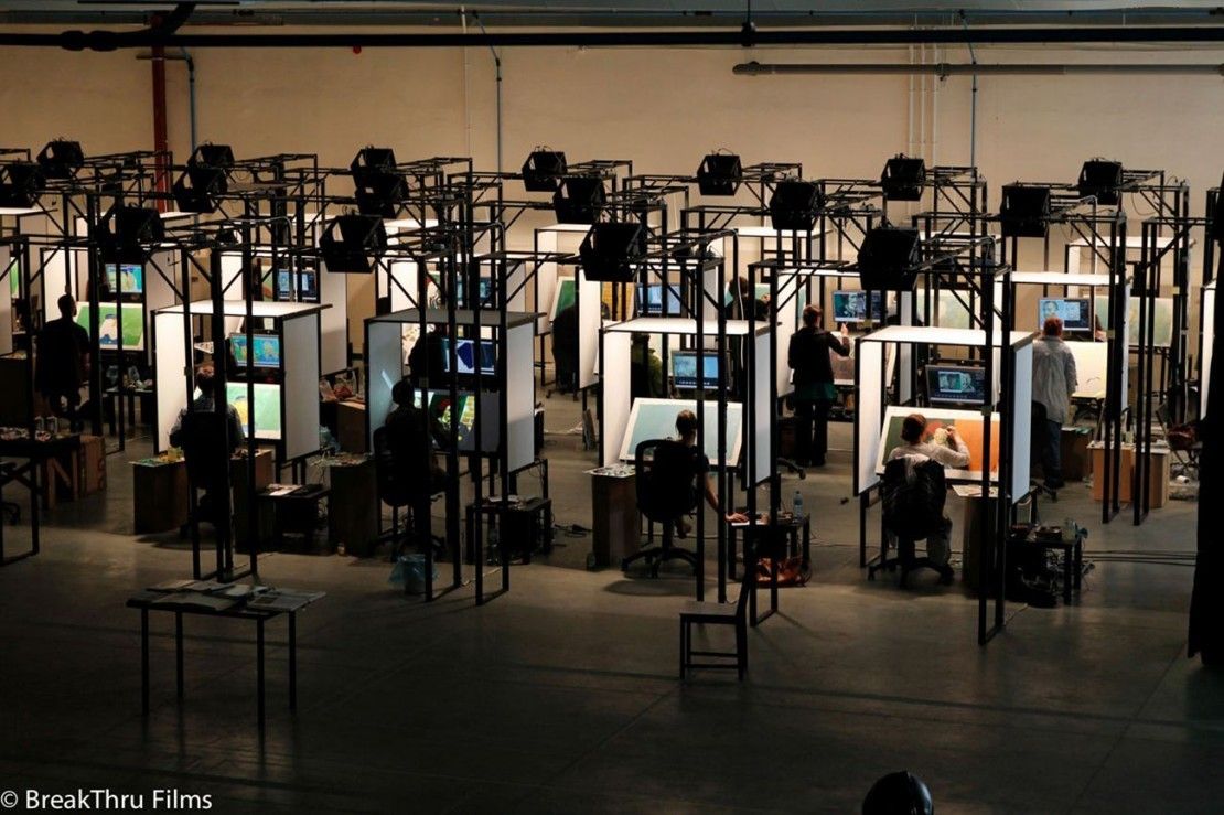
The making of Loving Vincent
Coming from a guy who doesn't know Van Gough well (or just any famous painters), I now know that he is famous because he painted through so much turmoil in his life. Now that's not the only reason why he is universally acclaimed and stuff, but I feel the strongest one is that his works "speak" to people. Personally I never encountered a piece of art (or anything) that made me drop dead, so it's difficult to understand how good art speaks to people.
John Akomfrah's Purple
By having 6 screens playing videos, Akomfrah is playing with how much we the audience can absorb. Normally artists expect you understand what's going on, or dumb it a little, but I think Akomfrah is intentionally playing with how much we see, like saying "How much you understand is up to you, you could sit here and rewatch every screen or whatever".
This is actually interaction with the audience
- multiple ways to investigate a piece, kinda invites us to explore them all (Hirschhorn's Hotel Democracy)
- instead of saying "this is the end guys, go home now", even at the "end" of one run people were hesitant to leave
- should we stay some more to watch?
- try to pick up whats going on?
- I call this constructive confuzzlement!
- due to the video's lack of narrative (linear, clear narrative), it's got the audience kinda scrambling for meaning
- through confuzzlement the audience makes all these connections that explain what is going on
- Akomfrah occasionally inserts some obvious messages to steer us the right way (basically be green)
What's probably my biggest take away is Akomfrah isn't pointing any fingers. He doesn't explicitly say hey audience be vegan or something, instead he is saying collectively as a result of progression we are poisoning ourselves and the environment. Which is all a breath of fresh air, because I'm tired of the usual go green slogans, trying to guilt trip people into eating tofu all day.
BRUTALIST ARCHITECTURE!
It was that super sandy day when I visited the Barbican, so everything was orange (and I loved it). Honestly I enjoyed being inside the estate, more than appreciating the works being shown because it's all so beautiful.
I'm not sure why I felt that way...But these did made me feel even better
- I went and touched the unrefined concrete surfaces (beton brut)
- There is a stark contrast between "living" and "community" spaces
- The colours were all muted and limited, everything was stark and rather gloomy
The firm Chamberlin, Powell & Bon unified materials with the design of the buildings to create something that wasn't only visually unprecedented, but conceptually successful (Robert Owen built his utopian socialist hamlet thingy, but it failed in the end).
Ok let's start with some facts:
- Post WWII Britain, lots of pits due to the Blitz, the government has this huge demand of houses
- Economy beginning to pick up the pace, not a lot of cash lying around
- People needed dem housez bad yo
And ta-da! the Barbican was born! Sure yes there similar developments that predates Barbican's inception (1955), but there were nothing as bold until it was opened on 1982. The estate was almost completely sustainable; it had art centres, schools, residential blocks, and most importantly space carved out for social interaction. Combine the need and the intent, and we can see the definition of Brutalism:
- Visually:
- Rough unfinished surfaces
- Massive slabs of concrete, heavy and almost intimidating scale
- Overtly displaying building's functions (service ducts, lifts, water towers...)
It's important that the creators were looking to create a "look", instead they were about the "feel"
- Conceptually:
- Modular approach to organisation; elements sharing similar functions are grouped together
- Compact, only take up what is needed approach to scale.
Habitat 67, Moshe Safdie, 1967 Hunstanton Secondary Modern School (Smithdon High School), Alice and Peter Smithson, 1954
- Safdie's 354 interlocking pre-fabricated blocks house a total of 158 units.
- It was actually his thesis for architecture programme at McGill, and it was crazy that he got the support to make it
- Protruding blocks overlapping each other create this beehive look, creating pathways on numerous levels connecting the whole premise, something like Smithson's streets in the sky concept
- Smithson couple's sec school glorified steel and and structure
- It was a bold testament in exposing the structure of a building
Autograph ABP, Zanaele Muholi
Ok, to make it super simple Muholi's exhibit is about race, yet she doesn't really add anything new into the dialogue. I say yet because race and promoting black culture and identity is something that is happening all the time, and actually social media is a better medium than her photo exhibition. Regarding her works, it's funny to see how she uses common objects to depict a certain group of stigmatised folks. For example, Bester V could be eluding to black servants, judging from the metal scouring pads.
Now I'm not against Muholi "reclaiming her blackness", but since she herself said that she that as a South African citizen she has responsibilities to help, maybe she could added something more interesting? This brings me to another point, I realised that to fully understand her works I needed to read the numerous magazines and books that were located around the exhibit.
Should works be readily understandable? Or should they be buried along with supplementary information? Yes, no shows can exist in a vacuum, but does the audience need to have additional information prior to visiting? To be honest I read a few books and mags and I felt all of them are about the same issue--stigmatisation against people of colour.
I believe good art gotta add something new and interesting to talk about, Muholi is doing something that we've seen a gazillon times on social media (and it has more of an effect on the web than confined in a gallery).
V&A:
- Something different from the rest, it's like a "lifestyle" museum spanning centuries
- Most memorable sections:
- Casting Courts
- Sculpture walkway
- Tapestry room
- Plywood exhibition
This sad lion (the saddest) belonged to a villa somewhere in France, which was a thing back then because wealthy people enjoyed having marble sculptures and pillars sprouting from their backyards. Most of the items on display in the V&A depicted the "lavish" lifestyle of Europeans when powdered wigs were a thing. From what I collected from the exhibits, I believe people living between the Medieval and Renaissance era based their lives on impressing others. Wealthy or poor alike would try their best to flaunt their wealth, either being a patron of the arts or having decorated villas. It wasn't enough to just be wealthy, you need to flaunt it around, and even to death. The casting courts and the sculpture walkway put things in perspective--it showed me what people were willing to pay immortalise themselves as wealthy people.
For example, tombstones similar to sarcophagus were often carved to depict the deceased sleeping, often with his/her partner. These coffins often came with an altar like roof, a little monument that houses the dead. At first I thought it was pretty absurd to have this obsession that everything must be "gilded", I mean even the spittoon is made from fine porcelain! But then they were a few centuries before the Industrial Revolution, and that meant most objects were made by hand. Guilds and skilled craftsmen were still a thing, and they are capable of creating insane embellishments, but most importantly the attention to each product.
Here is Bravery and Cowardice, and Justice with Deceit(?) its quite obvious who is winning here. To some extent art played a bigger role in the common folk's lives back then, compared to now. Sculptures depicting biblical scenes or virtues were common because of the high rate of illiteracy. What we see as exaggerated postures could be the artist's intensions, I mean they have to make it obvious what scene or the message was. Deceit's grotesque face is revealed when Justice takes off his mask and pulls out his tongue. Obviously his mask isn't going to hide his features, nor yanking out his tongue is going to prevent him from talking (or lying), but it's amazing how the sculptors used the human form as way of communicating, compared to a canvas.
The Devonshire Hunting Tapestry, Boar and Bear Hunt (1425-30)
Wealthy people used tapestry to decorate their gloomy chambers/castles, this particular one is 4x10m and it weighs 50kg. With its immense size, tapestry can also be used as insulation. Because they were labour intensive, only the wealthy could afford it. Naturally, tapestry would be associated with authority and wealth, and the subject would be aristocratic pastimes like hunting, or peasants working the field. Also they are portable because you can roll them up (maybe that's the reason why they existed).
I knew woven cloth existed as an art form, but the tapestry room in the V&A changed things for me. Standing a bit closer I can see each individual loop and I can't even fathom the amount of labour that went into this (Jakob's works can't beat this). For me, works that reveal progress in time are very powerful because, as stupid as it sounds, they remind the viewer that it didn't just pop out of somewhere, somebody bothered to sit through and complete it.
My first time seeing my idol's works, back in high school I could only print out images of his stuff and paste them on my workbook, but now I can touch it (secretly). Rodin's pocketed style, intentional broken limbs, celebration of the human body without any other themes, was revolutionary back then (but not without criticism). It's worth nothing that the emphasis is still the human body, what separates his work from any before was, it's just the body. Aside from his incredible skill in capturing and transforming the human body, I like to imagine how I would recreate his works. For example in the head of the left, I imagine he used a flat-edged scraper to achieve the unfinished looks, whereas the fluid lines on the right are all done by clay. You can feel the subtleness and softness of the flesh in the sculpture on the right, it's almost as responsive as Michealangeo Pieta. His works also inspire me to get my sketchbook out to draw, and for some reason I prefer drawing from sculptures than real models.
Whenever I see Rodin's or Giacometti's works I just feel happy. I get this feeling that I must embrace them, recreate them and sketch them, it's hard to describe.
Who knew plywood could have an exhibit of its own? Well plywood was actually invented way before Thonet pioneered bentwood furniture, but it was only incorporated into furniture and other industrial uses in the 20th century. Being cheap to make (gluing veneers in perpendicular grains) and easy to produce, plywood found its way into everyday objects, even some bomber aircrafts and vehicles. Chairs are objects that are 100% dependent on the material it's made out of; since plywood is thin and strong, designers capitalised on that and played with ergonomics and the structural qualities of plywood.
In the chair above (I didn't take a photo of the maker) the pencil rendering of the chair oozes simplicity, and the actual product is very simple. To be honest the chair looked very uncomfortable and a bit too wide.
In sculpture, one way to make your work more powerful is to unite the material with its form/purpose/message. Breuer's Prototype Dining Table (1936) and Gerald Summer's armchair both created something from a single piece of plywood, though Breuer had to mould the top and legs separately to prevent the legs warping and reinforce the legs with multiple pieces. A single piece of plywood already has multiple layers of veneers visible, that alone is beautiful to look at in contrast to the solid wood texture. A single material is purity, yes there are times when we need to mix wood with other materials but when it comes to furniture, and you want things to belong, wood is a powerful unifying factor.
On the other hand, in a room dedicated to modern design there's this metal mesh chair which obviously needs some sort of padding to be usable. I realised the placard did not correspond with the actual piece, because honestly all these post modern furniture sound all the same, like rejecting minimalistic and classic design. The Italian design group Memphis made this closet, and looking at this now I think it's pretty hideous, but back then when PoMo was a thing it was great. PoMo argued that there is no meaning in life (naturally this infuriated all other intellectuals) and viewed life with skepticism. Memphis might not believe in that, but their design certainly did have this "why not?" feel to it. Why not make everything colourful? Humorous and erratic design was kinda what PoMo design was like. This mistake is actually good! I learnt why people hated PoMo so much and actually I realised I was kinda PoMo. Obviously there are still some texts to go through to get an inkling of understanding, but I will once this prog tut is over.
Photo thingys
- I shot everything in the V&A on a DSLR and set everything on manual because I wanted to know under what circumstances to shoot what
- I wanted to improve my photography skills because I'm making pinhole cameras, and right now I'm making a new camera
Firstly I set y ISO to 100 because the film in my camera is that, I set my f-stop to 3.5 as a starting point and just modified my shutter speed. I think this technique is called bracketing? I did that for my film and I will show the results later. Shutter should be the first thing to consider changing when shooting photographs, because it doesn't affect the dof or graininess. However if the shutter is too long and there's no tripod, you change change the dof (if that's ok) or ISO(if DLSR). Another unique thing about DLSR is the white balance function, you can modify it digitally and for film it's set just like the ISO. This doesn't concern me because I shoot in B&W.
Aside from making things brighter or darker, the amount of detail also depends on the light. I'm not exactly sure whether its ISO or SS, but if I don't have a tripod I wouldn't be confident to hold the camera still for an hour.
For shooting still subjects indoors, I should change the f-stop then the ss. The sculpture doesn't move, and it's the only thing that should be in focus anyway, so the dof could be narrow. This might be difficult to gauge what's in focus while reading the hyperfocal distance on the lens, but on the DLSR everything is visible.
Up to now I still cant really tell which settings to go, but ISO-wise indoors it should be 400, and well it really depends on what you are shooting for the f stop.
- F-stop is dof, ISO depends on the lighting, just pay attention to graininess and ss should be be first thing to change because it doesn't affect the quality of the photo (unless you don't have a tripod).
Obviously there's still a lot of learn about photography, but honestly I learning from the technical side because I want to make cameras. A good pinhole has a large f-stop, that because a pinhole does not have any lens, so it can't refract light. Big holes produce blurry images because there's more room for more light rays to bounce around. There is also an optimum value for determining the correct focal length which I will talk about later.
The film was 400 ISO, this roll was dedicated to bracketing. A few paragraphs above I thought ISO determined the graininess, but these proved that it's just the amount of light.
Here less light means more grainy, grains are visible when each silver crystal got enough photons, but I still don't understand if grains disappear if there's enough light. I just know that there needs to be enough light to produce a clear image. Reading more about it, ISO itself has nothing to do with grain! Yeah a 400 ISO has bigger crystals than a 100 ISO film, but ultimately it's the amount of light. So more light brings out the graininess in photos. It was shot on my Nikon F-301.
In this case more light creates a sharper image, so yes in under exposed film the graininess is more evident.
No grains, but not enough contrast in this photo. To create more contrast maybe I need to darken things a bit.
So now here's the pinhole diagrams, I spent a few hours determining the view angle and the diameter made by the cone of light produced from the pinhole. At the moment I printed out a printout which late I will paste over card to make a mockup and test its dimensions.
The main point behind this camera was to make the film dimensions bigger, and since 35mm has a fixed height I extended it horizontally. To make sure all bits of the film were 5 mm from the pinhole (the focal length) I needed to curve the film pane. When curving it I need to install rods to guide the film from the individual reels, so make the reeling easier. My previous pinholes neglected the focal length and as a result, only the centre bit of film was developed. I will make a card version first then test it out, and if everything works out fine I will make wooden versions of it. I plan to make the design simple to follow, so I can upload the plans for everybody to fabricate this camera.
Works cited
Reading Week Reflection
Pinhole and Things Come Apart (Todd McLellan)
Well, photography and moving image's projects look interesting, and I need to learn about image manipulation softwares... No I'm not making pinholes just to get there, it's just that there is finally time for me to make a good camera.
This week was really more reflection than research; I sat down and wondered why I was producing so much crap instead of good stuff. This isn't high school or army anymore, the problems I face are not external but are internal. My brain is constantly getting stretched and overthinking about it doesn't help.
My previous pinholes didn't work because I was dumb, I simply went ahead and made a container for the film and completely ditched the focal length and the diameter of the pinhole. When I work I get sucked into this zone where I fixated on very small details, as a result I neglect looking at it whole. This happens frequently and for some people it's good, like they enjoy being the zone and having this rhythm, but I know from experience that this doesn't work for me. I need to be constantly "pulled out" so I can take a step back and see what's happening around me, like refer back to research I did, get inspirations from people who did similar things.
This is the most researched pinhole I've made: I've complied this design from numerous web sources, I scanned many pinholes on my scanner to see their diameters, I had to use trigonometry to determine the viewing angle and the coverage, and studying about film.
0.48 and 0.8mm pinholes. I measured them by scanning them first, then counted how many pixels/mm.
Long story short, I settled for a diameter that has a focal length of 5mm (0.24mm) and the film measures 130x35mm, so the film pane is curved to ensure every bit is 5mm away from the pinhole. I make pinholes because I want to learn more about cameras. I first got the idea when I found a website where a guy posted dimensions for his modular cameras, modular as in he posted schematics for guillotines, film box and other complicated stuff. I was still in the army then so I don't have the time to find a 3D printer to print and assemble it myself, so that led me to make pinholes.
I thought all the pinholes I saw were crudely designed and wasn't very user friendly, so I also designed them to be comfortable and reliable to use, which was super ambitious because I didn't know anything about film photography.
This time I printed out a template so I can cut accurately on any material I choose to. Yes there's still the width of the material that I still need to consider, but now with the 3D workshop open I can make it out of plywood (once the card mockup works).
Things Come Apart is a book about disassembling and photographing things. I originally thought I could see the schematics for a SLR, but turns out the essays inside were way more interesting than seeing a disassembled piano.
Everybody knows about the consumer's responsibility in recycling, but design-wise, not a lot. While this book focuses on why taking things apart is beneficial, the designers can enhance the recycling process by using special glue that melts away, leaving the components untouched. There are also biodegradable alternatives, these composites get triggered by high humidity or chemicals.
Anyway my point is in addition to making a product look and work well, we now also have to consider how it can be recycled. This goes way beyond using recyclable materials, we need to consider how to make it easier for people to break it apart and reduce the components to its raw form. This problem has always been around, but now the call for renewables is even greater.
\
Lastly, part of the reason why I started making pinholes was my desire to understand the inside of things, especially those things we take for granted. Wiens, co-founder of the teardown website iFixit believes "Too often...we throw things away when they break, squandering the years of work and thought and mining and manufacturing that went into them...[if we] submit to entropy...we forget that it is solving problems that make us human." The Industrial Revolution erected a barrier between creator and user, and Wiens is saying we need to break it down, because as humans it is in our nature to work with out hands. Ideally this would be great, as everybody can fix their products, and not just buy a new one when it breaks. However not everybody has the time or environment to tinker, it's not just not practical.
Throwaway culture thrives because people are just busy, why fix when buying a new one is faster? Maybe what we need are small scale makers, places where we can trace our products back to its creator. Big electronic companies would sell their schematics to the public, certain people would then tinker and maybe make their own versions of it...I don't know, this all sounds very collectivist and communist but this way more people can understand how tinkering is important? Right?
For me, I'm not going to start breaking apart my mac, instead I feel inspired to continue making things I can use. It has always been my goal to modify a bicycle into a motorbike so I will do that soon. Last thing that really stuck with me was that the pathway name doesn't force you to make works, in the end it's how you respond to the brief. I'm quite excited for the next project brief.