Poetic Cardboard
Some artists who work with photography, moving image or just text (conceptual approach to image making)
- ALEXANDER RODCHENKO (a really inspirational guy, need to research more)
- Aside from his Worker Suit, I learnt that Rodchenko could be one of the first designers
- "[Rodchenko] denounced painting as a domineering visual genre, preferring design, which challenged the notion of a work of art as a unique commodity, and, even more radically, promoted the idea of an artist as an engineer, a key creative force at the service of the masses."
- This makes sense because he was working closely with the Soviet Republic, and the idea of serving all really was in resonance with his own ideas
- CONSTRUCTIVISM
- "was a desire to express the experience of modern life - its dynamism, its new and disorientating qualities of space and time"
- "Objects were to be created not in order to express beauty, or the artist's outlook, or to represent the world, but to carry out a fundamental analysis of the materials and forms of art, one which might lead to the design of functional objects
- in other words, it was kind of a prelude to Productivism, where artists prefer to use their knowledge of materials and form to help others
- PRODUCTIVISM
- "promoting the idea of art as a practical, socially relevant endeavor with an emphasis on industrial production."
- so like Con., but one that makes its benefits more tangible to everybody
-
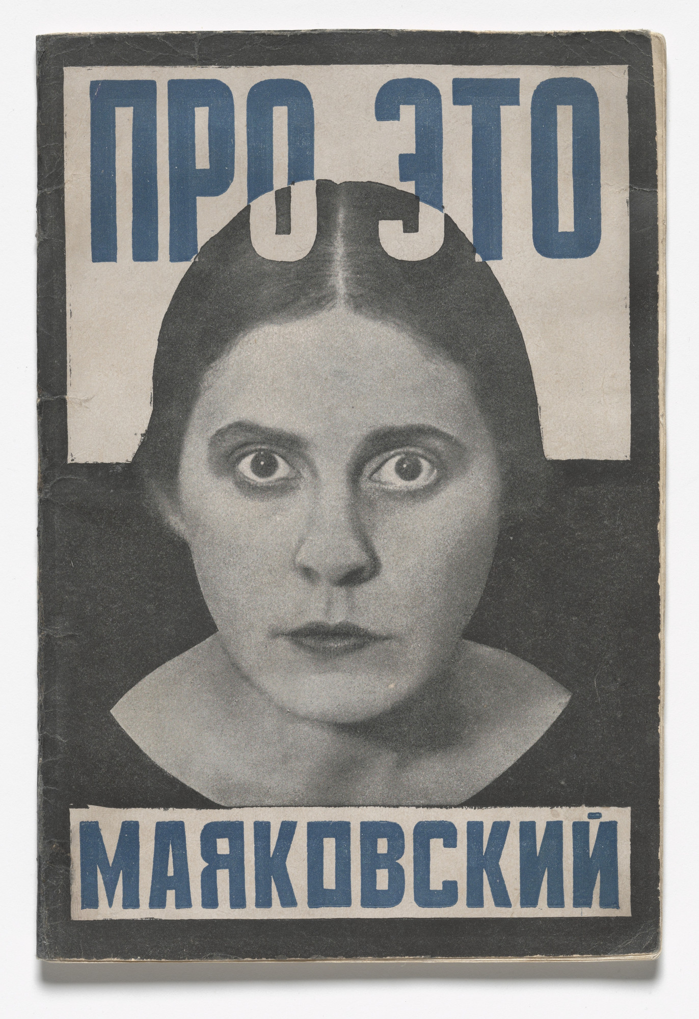
- Pro Eto. Ei i Mne (About This. To Her and to Me) 1923
- When I see this poster, I feel compelled to do something
- The woman's gaze and just a bit of her collar is showing making her look like a bust
- When the words touch her hair, they turn into a different colour, meaning the message must be damn important
- This poster was about denouncing the private agriculture sectors set up to help the economy, and since The Soviet Rep was communist, the people gotta know who's the real enemy here
- there are three colours: black, white and prussian blue (sophisticated)
- the background is split into two around the woman's ear, white on top and black bottom the words are primarily in blue, the bottom ones are contained in a white box
- There is a thick black outline that is visible only on the white side
- I think Rodchenko achieves the unifying the effect by having the black outline melt into the bottom half, and the bottom text box is similar to the top
- KATHERINE HAMMET
- ok so she got famous for her blocky and big letters on clothes, that were conveniently wore by famous musicians and celebs (Frankie goes to Hollywood)
- It wasn't really that hard to wear catchy shirts with big words on them
- Maybe it was revolutionary back then (1980's), that just means people back then didn't know much about text
- Not a big fan of her, but the reason why her shirt are so catchy could be because she keeps herself updated with current events, then come up with some aesthetically pleasing text to go with her perspective
- really really smart way to earn money
- Aside from his Worker Suit, I learnt that Rodchenko could be one of the first designers
- MYOUNG HO LEE
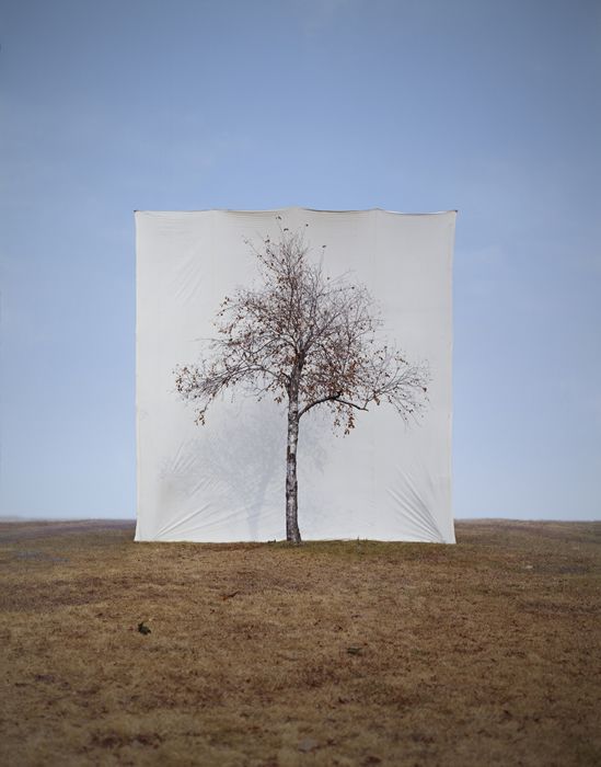
- In Tree, Lee "separates subjects from their original circumstances to derange the difference between subject and image"
- Juxtaposing solid white backgrounds behind trees to make it seem out of place was kinda my group's idea today
- Sometimes, the simplest approach to alienating something is to remove it from its background
Site Specific + Lost Letters
Good and bad design is everywhere. On my sketchbook I dissected a few pages from some magazines that caught my attention.
The first picture is the burnt Iraqi man from A+ magazine (article was about ethics in photojournalism)
- Picture made me feel queasy
- matching colours for his skin and bed sheet (which is unsettling because it's magenta)
- the light illuminates enough to see the anguish in the guys face
- which is twisted, unnatural position
A rioter being swarmed by police in a protest in Brazil
- It makes me feel sorry for the protester
- all figures are covered up, the black figures taking down the "lone hero", as seen from his bright red bag
- his limbs are all flexed and straight, putting up a valiant effort
Here I broke down what exactly Grizzly's new album cover meant to me
- most covers these days are used to facilitate sales, I honestly see nothing artistic about this piece
- So this is when I read why exactly are there album covers, and well, they "[create]a world for a particular album." (http://humanhuman.com/articles/the-importance-of-album-artwork)
- For me this cover, being so abysmally boring, really shines a light on how people buy music
- in physics it's true that light reaches you before sound, well that also means we see the album art before we listen to it
- music's important, but the art is also important for debuts, or reeling in new people
Wow this ad is so beautiful that I googled what exactly is an Art Pass and how to get it
- Basically it has a unifying feel to it
- Hepher's artwork shares similar colours with the card, and both are squarish
- the _ from the logo ties the text to the card
- the eyes naturally flows down the page
Breaking down and analysing is something we all do everyday, it's just another step to actually document them and remember their techniques. Graphics is really cool because the greatest illustrator doesn't hide his work from anybody--it exists in the public domain. If we just see enough of it, understand what it means, then maybe we can make good posters too?
Southbank walk+ Design Museum
Modified Social Benches, Jeppe Hein
Before, benches were objects we could sit or sleep on. Benches also has this social aspect of it, like obviously your butt won't take up all of it so other people can share it. Hein wants us to remember that benches have this special ability to allow people to congregate, and what better to do that by taking it away? This is simple and effective, but personally I don't really care about this piece of art, just thought it's kinda weird that theres an orange bench in the middle of the road.

Sam Durant's "Like, Man, I'm Tired of Waiting" was taken from a protest in 1963 about the American Civil Rights Movement. A humorous approach to something super serious, Durant's poster was installed in 2002, and now removed from its original meaning, it could be applied to everyday things. A huge handwritten note like this tells the audience that it's not super serious the message, and nowadays, it just serves like a popular backdrop for people taking photos.
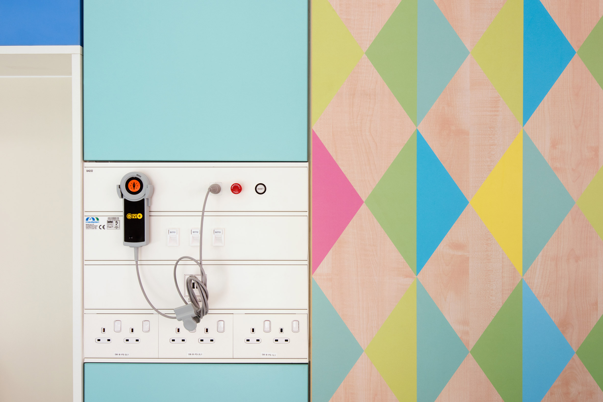
Morag Myerscough's Designer Maker User wall, and Sheffield Children's Hospital
Morag is behind Studio Myerscough, known for its big bold words and also colourful designs. In The Design Museum her team set up the wall that shifts from word to word.
- Originally I thought anybody could really come up with big bold words and little triangles behind it
- Then I read about her other works like Sheffield Hospital, how she had to consider using plastic laminate for the surfaces, make it lively by making spaces that hid the machines and so on, I realised a designer is more than just a designer
- The term designer is misleading, it's really a multitude of other jobs, in Myerscough's case it's also maker, and ultimately being a user
- Making a space that is traditionally very cold to a livelier place

Vignelli made the NYC subway map in 1972, Henry Charles Beck made the London Underground map in 1931, and this modern Singapore map that nobody wants to own up
- It was a bold decision to make underground maps in these manners
- simplicity and ease of navigation took over accuracy
- bright fruity colours and fat little tubes are used
- basic geographical features are included to give some context(though Beck originally did not include Thames)
- We gotta understand the intent of having a train map
- people arrive at the station knowing where to go, but not how
- it doesn't matter how far between each station is, people need to know where to switch lines and the best way to do it
Graphics really misleading because it covers more than just designing, I wished I had more time this week to fully explore the realms of graphic communication.
Poetic Cardboard
- Use photography and moving image to create a narrative
- Idea: bring up how many students here feel like fish out of water, an alien in London basically
- We were inspired by Miyoung's Tree works, and also Liu Bolin's crazy ass camouflage works (Hiding in the City) so we wanted to do something similiar
- Using a transparent piece of plastic with drawings on it, juxtapose it with its surroundings
- The drawings would be stereotypical Asian associations, like dumplings or a fishing boat
- We wanted to play with the usual stereotypes of Asians in London, because it is how we are viewed here, basically embrace them
- Through depicting insanely outrageous comparisons of our Asian background to Western landmarks, where traditionally no there are no Asian influence, we hope to the viewers can do some self reflection of our presence and our struggles of fitting in
- Our tutor said our original idea of depicting people trapped in our little pokeball drawing was too complicated, so we slimmed it down to Asian representations in places around London
- For instance, the contrast would be quite obvious if we had a drawing of a lantern hanging out from a church
- We wanted to portray how odd we feel, like how odd a lantern is on a church
- For instance, the contrast would be quite obvious if we had a drawing of a lantern hanging out from a church
- We faced some problems:
- The little signs were quite flimsy, and it was hard to take a photo against some surfaces (the markers wasn't very visible)
- The location we shot wasn't very planned out
- The construction of the signs could be better
- = Instead of rectifying
- Next time I'll:
- Actually go recce the sites before photographing them
- The entire shot will be the sheet, that means no sticks (breaks immersion)
- Taking this idea further:
- Instead of just having little doodles, photograph people
- It could either be a group of people standing amongst a background that really separates them
- It could be a throng of people in an empty space, say like Hampstead Heath
- Taking this idea further:
- Enough negative things, what went well:
- got a solid idea quite fast
Lost Letters
- For the lost letters project I was given letter 3, with the bottom part elongated, like a profile of a vase.
- I've used the letterpress to print my zines before, the imperfections and gradient gives each letter some life
- In my past prints using intaglio with plexiglass and linocut, I had always embraced my impulsive and "messy" method of working, however this papercut project demands more attention to craftmanship, and that was one reason why my product didn't end up very pleasing
- I saw if I mirror the 3, the negative space created resembles a roasted chicken, and the 3 outline is the plate
- I included a table outline to contain the piece and "ground" it, providing some context
- added the cutlery and plates to populate the sparse table
- I wanted to extrapolate the 3 and make it meaningful for me, in this case it's Thanksgiving dinner!!!
- What I had in my mind was a romanticised image of my project, and I did not bother making the actual one look anything like it
- At this point was one of my major conflict, to continue working with my messiness, or to diverge into a new style
- Working with a tight schedule, I have to churn out a thoughtful design
- It was a struggle to contain and make my work clear with very linear and deliberate lines
- In the end I rushed out an idea that was hurried and wasn't properly planned out
- I was hoping to rely on my usual method of making up as I went along, but this medium demanded attention to detail as, every cut is permanent (tells a lot why I prefer charcoal...)
- In retrospect, it's interesting to have this struggle, of like a different medium demands the user to modify his/her approach, and that fundamentally affects the style
- I guess I will find out more as diagnostic goes...
- I didn't exactly referenced anything while doing this, if I had more time I would research more about how to make simple and attention seeking graphics (more on that later)
- Also if I could change my project I would do these thingys:
- make full use of the space given, give the object a direction for the eye, and somethings must kinda go off the page
- vary the texture of some negative spaces
- refine and my thought and making process, make things neater and more planned out
- Also if I could change my project I would do these thingys:
- As a result of this traumatic experience of failing epically
- I feel an urge to understand and compare how images and text affect me, and also break them down and understand each component
- I looked back at Rodchenko's poster I researched, and now I shall set it up in my mental altar, just because it makes me so nervous even I know jackshit about Russian
- I watched Favre's hide and seek and is still seeing those yellow and black lines
- The funny thing about illustration is that I don't really know whether I'm looking at one or not
- Like is it a graphic, a chart, a timetable, a magazine page?
- I guess the answer is everything that is trying to convey a meaning through image and text
- I went to LCC today and picked up some magazines and tore out examples of good designs
- I want to document and break it down, but most importantly how they affected me and why
- I feel an urge to understand and compare how images and text affect me, and also break them down and understand each component
Site Specific
This was the most frustrating project I have done so far, every time I completed a concept, plan or something all my peers seemed to have something stronger and more developed than mine. Our task was to use the campus and give it a story by using text. I found a window with a corner that had a hole in it. I chose this site because the jagged edges and the hole creates insightful stories. I wanted to tie in a Chinese proverb, ???? (frog in the bottom of a well) because the window was textured, and the hole was a glimpse of the world outside. Because all graphic needs to be understood by everybody, my proverb could only be caught by people familiar with the story, so I treated the hole as a door, signalling that there's more outside to be explored. My message was simple: get outside, there's more to be experienced outside.
I found it difficult to apply any sort of research within the time limit of this project, I mean for 20 minutes we were introduced to artists who demonstrated some forms of typographical intervention, then some student works shortly after. Then suddenly we need to pick a spot and start to have an idea of what text we want... Definitely Myerscough's big bold text and Hamnett's text were in my mind, but I cannot apply them to this context. I went back to the site and applied the 1st version of the installation, and luckily I did that because it looked awful and I feedback from my tutor to make it simpler.
Just because I stopped at the 3rd version doesn't mean I'm satisfied, I still think this is extremely ugly. But it still does the job because my peers can understand the message (red door rug, door is O). I decided to have a red door mat to make it more obvious that the O was the door, telling people the hole in the window is actually a gateway. What didn't go well were a lot of things actually, like how I thought I was restricted to using only text to convey my message, how I can't seem to think freely or just create anything I can be proud of. It's easy to just blame the new medium, but I feel why I can't catch on to this idea is because I didn't see what was happening around me, like what others were doing.
Wow this was hard, and I learnt it's actually wise to do little reconnaissance of the classroom, and to stop stubborn and sticking with my own methods.