Collection Pt.1
Collection, to put it simply is pluralising something. We can impose rules on what and how things are gathered. However, I argue that a collection must have purpose, more importantly the creator must be aware that he/she/it/they/whatever is making a collection.
(Analysing only through the collection)
In White Cube there are two artists who demonstrated what a collection looks like.
Ann Veronica Janessen uses multiple objects and "minimal sculpture" to "[explore the] spatio-temporal experience and the limits of perception". Ok so basically themes that deal with visual manifestations of time and decay and all the usual "I'm an accomplished artist and I deal with meta physics" things. This space includes the " 'Dichroic Projection' [the coloured lights] ...[that] exposes how different coloured lights can create charged atmospheres, specific perceptual effects or psychological moods" and also the the "Aquarium" that "[exposes] optical or spatial contexts and shift perceptual understanding" by constructing a cube with multiple mirrors and coloured paraffin oil.
Firstly, this is a collection all right albeit an extremely boring and tiring one. Her "rule" is that all her works explore time and perception, visually her works take on various forms though all of them are sculptures. To a certain extend she recontextualised the halogen lamp; instead of illuminating she delves into "perceptual experience wherein this materiality is made unstable" (I'm not going to translate any of that).
It's quite obvious I didn't like this exhibition at all. What fuelled my frustration and confusion was that her theme was way above what I can comprehend. I left feeling inadequate and dumb, and it made me reflect whether I should level up to appreciate this, or simply say "I don't like this".
Breaking it down, I feel her works feel scattered and lack a focal point. Unlike Shiota, her installations wasn't utilised effectively to bring out her message. Everything felt like a diorama, where each corner or section of the space has its own activity.
http://whitecube.com/exhibitions/ann_veronica_janssens_inside_the_white_cube_2017/
The other exhibition in White Cube was actually recommended by the tutor, as a component of it deals with data collection.
Damian Oretga "Play Time" explores themes like aesthetics, game play, chance, and culture.
Collection in this exhibit means:
- numerous visually or conceptually objects that belong as a group
- gathered data posters that are juxtaposed with "visual essays"
Genealogy of Anything is the series that the concrete mould of the styrofoam packaging. From a collectivist view, Oretga connects the objects together by materialising the positive and negative space. Arrangement wise, both sides of the mould seem to be accelerating from the centre (kind of like the rapidly expanding universe), thus having this narrative feel to it.
Data collection? Well his posters, on the surface level, deal with the impression of collecting data (cosmology or diagram). Second glance however, he took out all the quantitative bits and replaced them with words. His visual essays deal with the demise of democratic order and other philosophic stuff.
Lastly, in his "Coliseum: Diagram of Time" each block represents 5 minutes within the total 90 minutes of a football game. The way it's organised invites audience members to step inside and view it from the inside. Undeniably, you are going to feel like Godzilla in a stadium and that's all because of the repetition and size and the glazed clay sculptures. It's interesting that simply the arrangement of the sculpture can alter ones scale.
To summerise, both artists took a super different approach to what collection means. Traditionally there's On Tawara's Today series that explores how to interpret time. Everyday Tawara would paint the date over a monochromatic background, along with a snippet of that day's news in whatever city he is in.
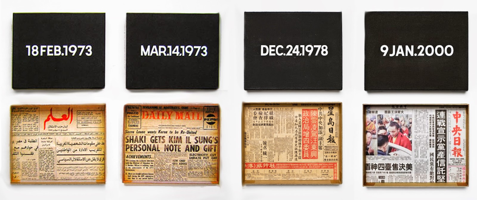
On Tawara, Today (1966~)
This case is special, because it's actually the curators who organise and present them as a collection, and not Tawara himself. To give his works context, curators present them formally--it accentuates the lineage and also narrative aspect of the piece.
(https://www.creativeboom.com/inspiration/its-play-time-with-damin-ortega-at-bermondseys-white-cube/)
(http://whitecube.com/exhibitions/damian_ortega_bermondsey_2017/)
Collection is a tool, medium and method:
- tool in a sense of generating ideas or actually making the work
- medium as how they can be arranged and presented
- getting other pieces of work to interact with one another, a method of reinforcing an idea or theme
More Research
You know, whenever I write something for workflow there are always pages of handwritten notes written prior to typing. Instead of just tossing them away why not put it here? It's the exact same thing and it saves me lots of time. The paper breaks down the themes of the piece, and below I'll write about their influences.
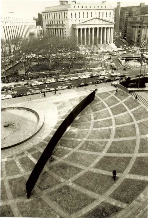
RICHARD SERRA, TILTED ARC (1981)
- Yup this piece, to be honest maybe it was always subconsciously fuelling me to create works that provoke other people (I did researched it a long time ago). You can't get anymore blunt with this piece, seriously having a huge metallic wall that block those busy New Yorkers, that's insertion with a capital "I". However, Serra did say the piece died when it was uprooted, something I feel that's a bit contradictory...
- Serra placed this wall to force it into the lives of daily commuters
- The authorities wanted to relocate it but Serra say it dies when its out of its habitat
- The concept of participatory art lives on, the story of its sad struggle of existence is actually stronger than it being there
- In other words, its removal cemented the idea of "in your face" art
- In your face can take many forms, Serra just struck the top of it
- Nowadays everybody wants to either get their opinion heard, inflame others, or just spew random nonsense.
- Serra in a way, predicted that in the future there will inevitably be "in your face"
- The very least we can do is propel some kind of good message...something REALLY GOOD
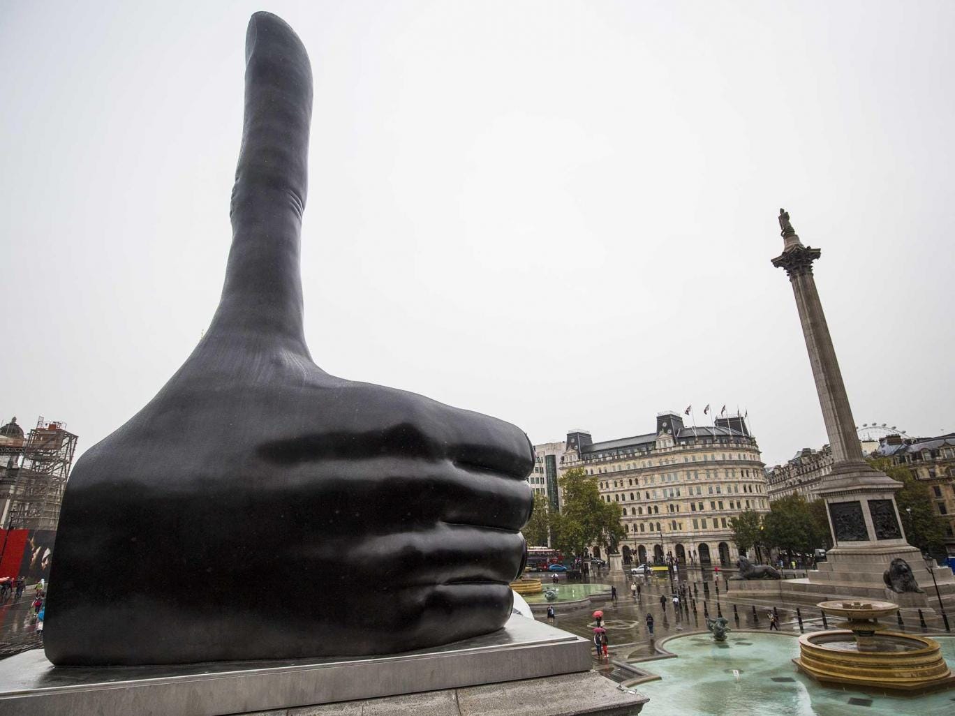
DAVID SHRIGLEY, REALLY GOOD (2016~)
- Ya know, these works I've researched are actually done after completing my Industrial Basketball piece. These works were recommended by my tutor because they were either interactive or just in your face.
- People can go on and on about their interpretations of his thumb, but honestly that's what so nice about this piece--it's so simple it's profound
- Compare this to Oretega or any of White Cube's artists (no offense), you brainwash the audience into blindly " admiring the heightened sensibility and ingenuity of such artists" (http://www.visual-art-research.com/2010/03/ping-pond-play/)
- No, great art by great artists don't deride its audience and belittling them into thinking they are a bunch of toddlers...
- Art is assessable, it needs to provoke and inspire people into being better versions of themselves

CARSTEN HOLLER, FRISBEE HOUSE (2000)
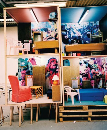
THOMAS HIRSCHHORN, HOTEL DEMOCRACY (2003)
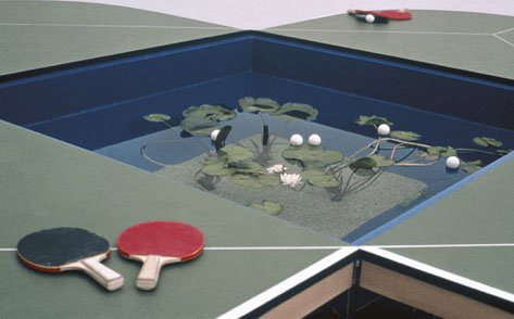
GABRIEL OROZCO, PING POND TABLE (1998)
- All these works were featured in Tate's 2003 Common Wealth exhibition (exploring participants vs audience)
- Simply put, these works must be experienced physically to understand what it means
- Combine it with elements of fun, or force audience members to walk around and examine every little box...Works that more than just "gaze upon me" has this next level of conveying its message
Basically what I'm saying is that looking is good, but doing is better. In art, feeling charged from a piece of artwork is the result of the piece speaking to you. You can achieve this by either being "in your face" or interacting with the piece itself.
Sources:
http://www.culture24.org.uk/art/art18657
http://www.tate.org.uk/whats-on/tate-modern/exhibition/common-wealth/common-wealth-artists
https://www.designboom.com/art/thomas-hirschhorn-s-hotel-democracy-at-art-basel-2008/
http://www.tate.org.uk/context-comment/articles/turning-the-tables
http://www.visual-art-research.com/2010/03/ping-pond-play/
http://www.tate.org.uk/context-comment/articles/gallery-lost-art-richard-serra
http://www.theartstory.org/artist-serra-richard-artworks.htm#pnt_4
Collection
1) I documented how people interacted with a banana peel in a public area. I took about 20 photos over 40 minutes, and took notes on a journal during interesting moments.
2) I recalled Gillian Wearing "I'm Desperate" collaboration, how they revealed some deep secrets of passerby on the street; I wanted to do something similar, but made the choice of interaction optional. I chose to document those times when somebody physically touches the banana.
3) I presented them with a slideshow and with a journal with date and time in regular intervals.
4) In the group the feedback didn't account to anything interesting, so I went to ask the tutor instead. He told me to take it a step further by incorporating some instructions in space-- encouraging people to place their trash in places of prominence.
5) I represented my collection by making sculptures of the banana and cigarette. The process of making a sculpture makes it clearer for me to see how much more I can alter the piece.
6+7) Honestly it wasn't very successful at all, it got some laughs and sure it makes people ask why, but other than that it was pretty flat. I felt I didn't hit these points:
- recontextulise the subject
- there wasn't a profound connection between the series of photos (presentation wasn't effective)
I feel I had a good idea, but it could have been better if I sat down a bit longer and thought about it.
In the beginning my idea was simple, it was simply about documenting how people treat my banana, and amassing a collection of photograph with written descriptions of what happened. In my mind I had this image that people would find it amusing to see a banana peel in the middle of the street, and then react to it.
(kinda like this)
I realised that about 15 minutes in nobody notices the banana, so I placed it on top of the bin. It was all sprawled out, inviting whoever went to throw trash to see it. At that point I realised the banana moving closer and closer to let humans interact with it is like a story, an animistic one where all the peel wants is human affection.
Experiments like these require knowledge of the local culture, and that's something I lacked. I assumed that the people would interact with it, but in retrospect this was a busy intersection, so people probably didn't have time or the attention to notice it. Wearing made it all so easy by saying a random street, whereas in reality it takes time and knowledge to plan the location.
Final Day
Ok so last day of fine arts and diagnostic, and I think I did pretty well for this project. I collected scrap and junk from the studios in KX and the courtyard at Archway. For me going back to found objects and repurposing them is always something new: visually they are differ in scale, material and form, however conceptually they all were components of larger piece, all cogs of a great machine, all used and discarded for various reasons. I realised that I enjoy working with restrictions because it limits the playing field, I prefer finding ways around obstacles rather than creating an entirely-new scenario with obstacles. Found objects are my way limiting myself.
Material details:
- Iron square rod: a larger rod that was separated in two diagonally, then solder on, roughly 120o.
- Plywood stick: multiple layers of wood can be seen from the side, very beautiful and sturdy.
- Window grille (?): Resembles a cheap ironing board, there are actually two sides. Interior space is divided into numerous squares, looks like aeroplane wings also.
- Chimney(?): I think it was used to channel out sawdust. There are three openings, two located 90o of each other. Surface is either galvanised or looks like it. Quite heavy.
- Bucket: I admire the little spout that breaks the circular continuity of the rim, it's so minuscule yet so obvious.
This project also made me realise that I work and plan by working. In other words, I think by making. Firstly, I elevated the surface to make all the objects visible from all angles, I felt the rectangular table contrasts well the circular rim of the bucket so I placed it in the centre. I felt I hit the "geometric jackpot" when the bucket is just in the middle of the table, where the four legs seem to contain it.
I tried to extrapolate some shapes and form from my drawings, to see where I can place the next few pieces. I wanted a unified feeling so they all had to either in contact, or unified by some other means.
- I played with the direction that each piece possesses
- When I place the window grilles diagonally, they direct the attention to the centre
- The chimney adds a vertical element, while sharing the hole-ish look with the bucket
I'm not saying the composition is perfect, I just exhausted the use of all the pieces in my composition in a sculpture. My peers said it reminded them of an "industrial basketball", with the holes being nets. The idea of basketball intrigued me because I my message was to remind people that art can also be humorous and entertaining. Thus, this piece is now an interactive one.
Whenever I use found objects I remember Tracy Emin's Salem (2005). Visually it doesn't translate obviously, but it's just the concept of velocity in reclaimed objects. I feel inspirations, for me at least, take form of concept and not visually; I can be inspired by an idea, but not the look of it.
The tutor recommended that I extend my pieces, so I decided to lead the audience in a little hunt for the next "hoop". I included some instructions next to my first site with clues leading to the next one, which actually didn't work because it wasn't obvious enough. It was a good concept, but the second site wasn't very fleshed out because it lacked the stage and atmosphere that the first site had (maybe with more time...).
The final piece was located at two sites, one inside the studio and the other one right outside it. The audience were invited to just toss, or to "get a free meal" from me by completing some challenges, which were impossible because I am not intending to give any meals. Feedbacks I've received were honestly pretty banal and nothing new, they were all either "very fun", "reinventing rubbish", or just "industrial". People said it reminded them of sports, or even the App, Paper Toss.
Technical-wise, the sculptures could have benefited from more materials, but honestly the biggest takeaway was cemented my sights on 3D as a pathway. Yeah, 3D design might be good, but I feel exploring from within is more interesting than responding to the desires of others. I can work large scale, involve the audience and make everybody happy.