Wear It
So today I learnt that simply by feeling and interacting a material counts as a primary research, and secondary is like reading about the material.
BENJAMIN JOHN HALL, LAZARUS WEDGE
I now know more about catwalk fashion, like specifically objects wore solely on the catwalk. Hall's Lazarus Wedge shoe has to get the attention in a short span of time (similar to a mayfly's lifespan really), and he does it by using fire with the shoe. Commonly people associate fire with destruction, Hall uses it to shrink the material and reveal its true form, like how phoenix rises from the ashes (his theme was rebirth and stuff).
SHAUN LEANE FOR ALEXANDER MCQUEEN, CATWALK JEWELLERY
Leane provides another example of the short lifespans of catwalk jewellery. Like the shoe, the focal point of each subject is the jewellery. Both Leane and Hall challenges how we wear our stuff on the body. That's not to say everybody should be wearing fire shoes and metal gauntlets now, but they provide narrative and accentuate parts of the body where traditionally they are neglected. What we briefed about catwalk fashion today made me see it in a different light--before this I thought who would wanna wear trashbags and all these outrageous things? But now I know it's obviously not to be worn as clothes, but are canvases with the purpose to provoke a response from the audience. The designers have this intent and theme they want to explore with their works, but ultimately the show needs to have memorable bits, and to put it bluntly the audience needs to be entertained and wowed.
SCOLD'S BRIDLE/BRANKS
Which brings me now to my own interpretation for today's assignment....the branks! I was going with the idea of surround and support, then I remembered that people used to wear these things as punishments. My original intent was also to provoke the audience with my more grotesque version of the bridle, one with a c-press like device that can squeeze the temple of the head. Then I realised I had to make it out of paper.
.
SINGAPORE ARMED FORCES, INTEGRATED LOAD BEARING VEST (ILBV) === > EXPLORING CARDBOARD PAPER
I started work on the main part of my vest, I made rough measurements on the weaving and ladder system. I made two little pouches of different dimensions and attached some paper straws to flatten the shoulders.
To make the product easier to wear I weaved a metal wire in one side and made a little flap on the other side.
The end product looks a bit lopsided but the idea is there: a customisable teletubby vest.
Cardboard paper is
- malleable and sturdy
- since it was rolled up, I used its curvature and cut with the grain of the paper to get the vest to surround the body
- it has good adhesive qualities due to its textured surface
I wanted to bring over something that was reserved only for the military for civilian usage; the MOLLE (modular lightweight load-carrying equipment) and PALS (pouch attachment ladder system) are both highly customisable aspects of functional protective wear. I took inspiration from my previous experience of using my ILBV then created a mock up version that explores cardboard's ability to respond to the shape. Although it did surround the body, it is quite uncomfortable to wear as the paper is hard and flat.
Use It
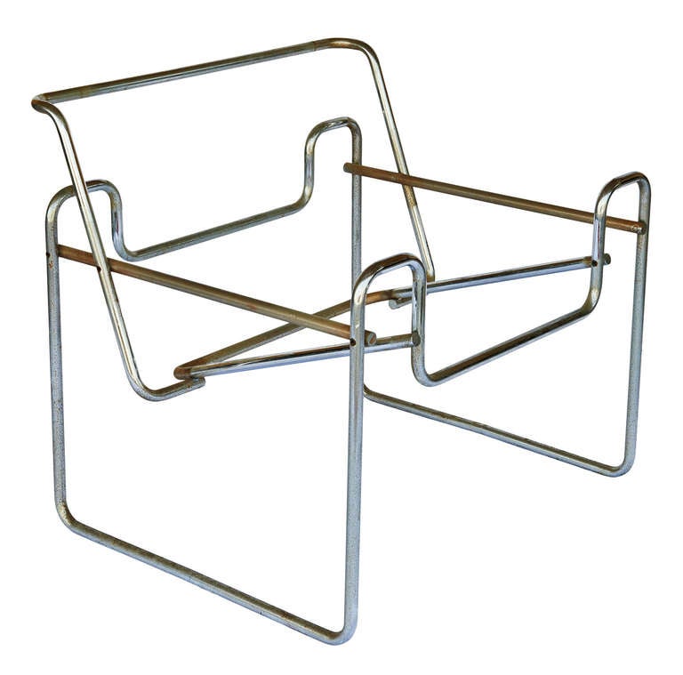

Marcel Breuer Model B3 Chair, 1925-1926
I decided to focus on chairs made during when Bauhaus was still in operation. It was an explosion in combining art with industrial products-- what we call design today. The head of the school, Gropius, banded together like-minded artists and cultivated the idea of combined craft with art. I'm drawn to this idea because it was a pivotal turn in design history, and it was vastly different from all concepts previous to this.
For the chairs specifically, I'm interested in:
- how they all stem from a geometric shape then grow from it (squares)
- the very clear and linear quality of armrest and legs
- angled surfaces for the body to rest on, basically challenging how the body can sit on it
- exploring different and new materials to use
Breuer's chair
- The body rests on the fabric that is bound by parallel rods that are also symmetrical
- Nowadays this idea is widely copied, but Breuer did it way back then and it caused quite a stir
- It has a very collapsible feel
- I could adapt this design and make future chairs that are collapsable with hollow steel tubes
- I never been on this chair before, but previous experiences with chairs with suspended fabric:
- makes noises when people adjust on it (not very pleasant)
- people cannot rock it chair
- the angle of the seat is acute, so like users would need to lean forward to sit upright
- if the fabric are sewn together, it would be difficult to wash

Willem H.Gipsen Diagonaalstoel , 1930s
- Visually similar to B3, this is a further reduction on materials and complexity of lines
- I found it interesting that Gipsen decided to have armrests stem out from the backrest
- The user would be in an awkward position as the rests are quite thin
- From this chair, I believe armrests for chairs should be reserved for chairs that has more mass, or like volume to it
- it wouldn't make much sense for chairs that are light and portable to have armrests, since most likely they are used in places where people just stay for a short moment
- It looks decent, but this chair isn't practical, it's a conflict between function and comfort

Josef Alber The Club Chair, 1928
Alber designed this while he was furniture director of Bauhaus, and aside from the fact that it resembles the linear and geometric qualities of previous chairs, it has padding
- Padding adds the volume and weight that Gipsen lacked for the armrest
- It has an angled seat like Breuer's, and both of them are attached to the armrest
- Alber combined both legs and armrest by making them into a square, and the seat is sandwiched between these two hollow and sturdy structures
- Although the materials are not as futuristic as the rest, Alber's chair has a sturdy quality to it and all materials work in unison
- It's solid wood makes it more of a chair for relaxing, hence the club chair
- Aesthetic-wise, the chair between the two simple squares, almost like being squeezed from the two square
It is interesting that such an important school was eventually closed down for being too modern (to put it simply). The fact that we have talented and creative people creating objects for the common folk, something so noble, is shunned by the government back then (Nazi) is quite shocking. It really comes to show how even an elegantly designed mug could have politics related to it: was the institution behind it approved by the government, the designers background, or even where the materials were sourced. Bauhaus is really a treasure trove of art, and art's relationship with other subjects.
Don Chadwick and Bill Stumpf, Aeron Chair, 1994
Behold the office chair that started the lumbar support craze...Isn't it interesting to take good design for granted? We use objects that have been refined over and over again, so when I first saw this Aeron chair I didn't register it as anything significant. But when I read about it, then well I guess it was something pretty big.
- It is hard to separate the marketing terms from the real design aspects
- the pellicle (their term for the fabric) differs from the upholstery previous chairs used before, it ventilates and is transparent
- The screen-like material allows people to see the skeleton of the chair, the real reason why it's so comfy
- the new pellicle replaces the usual foam, and that helps the environment
- This chair made me realise that I take good design for granted. I didn't recognise that this common chair now was such a big thing in 2000's.
- What I call simple or normal didn't exist a few decades back
- Design is still new, and there must still be quite a lot of aspects of it we didn't explore
- the pellicle (their term for the fabric) differs from the upholstery previous chairs used before, it ventilates and is transparent

Nina Toltrup, Pallet Chair, 2010 Thomas Lee, Adirondack Chair, 1904
Toltrup created a range of furniture using wooden pallets. It was part of the Pallet Project that started in 2008 and invited people to create furniture that was £10 or less. The instructions were all available online. Toltrup took practically and availability to the extreme--she basically separated the tush from the ground in the simplest way. Similarly Lee sought out to create a simple chair for his family, and using only 11 planks of wood he made the Adirondack, which is now associated with summer time in America.
- Both chairs' seat are angled because of the rear legs
- Lee created for comfort and simplicity, whereas Toltrup reduced everything to its minimum
This goes back art and social effects, just by setting up a charity by selling Toltrup's chairs, she makes people realise that some people's lives have not been touched by design. Sure some people living in developing or under developed countries have devised ways to get by, but I believe a cleverly designed product is universally appreciated. In other words, anybody can recognise a product that just works, better yet people can also break it down and analyse why it works. By incorporating simple and elegant designs to people who are not used to seeing good design can spur their desire to create better products.
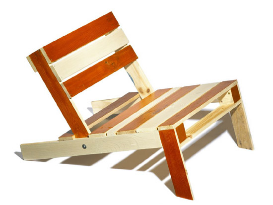
On the day this class was taught I was sick, so I read the brief and created my own chairs.
- I created the chair on the right first, I realised that cardboard isn't a good material for miniature objects because it has the wafer thing inside that prevents precision bending
- The idea behind was to create a chair that surrounds and provide just enough shape for the body, hence the nose shape
- For the barstool I wanted to create something familiar yet more comfortable than the usual stool
- The little area that dangles from the seat gives a tactile response for the legs--a little reminder that legs are dangling
- Backrest supports the lumbar and is the only necessary bit
Build It
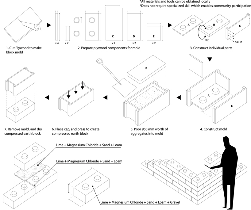
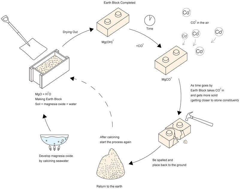
Yasuhiro Yamashita, Earth Bricks (Chiba Prefecture) 2011
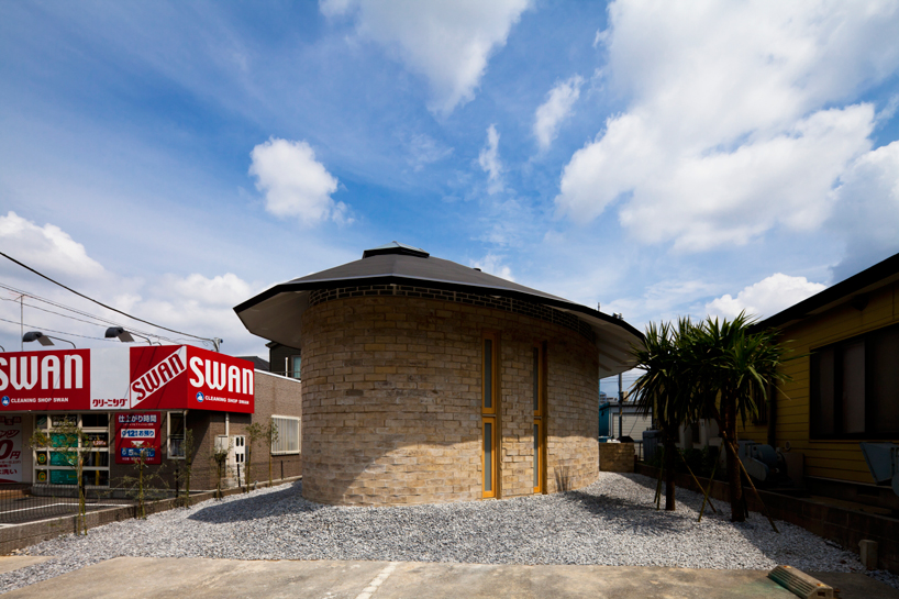
- A seemingly small house, Yamashita is known for working with limited space
- Japanese houses are particularly interesting for their design and material usage
- The houses need to withstand earthquakes
- Island nation means limited access to certain building materials
- High population density mean most people can only afford to live in smaller spaces (Chiba is pretty ok
- Yamashita designs buildings that makes people wonder about the interior
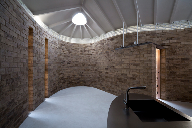
- The vaulted ceilings provides lighting that can be seen on the exterior of the building
- The walls are made out of special bricks that can be sourced locally and is environmentally friendly
- This is the practical aspect of Yamashita's project, aesthetically it's nothing groundbreaking, the materials for brick can be found anywhere and it actually strengthens over time as it's exposed to the atmosphere.
- Earth Brick is a demonstration for the "lego-ness" of these bricks, and it's an excellent way to showcase new materials
- Shows how lack of materials isn't a bad thing
Lucky Drops, 2005, Tokyo


- Interiority plays a major factor, residents need to feel they have proper space to live in
- Yamashita takes advantage of the 29.3m length and places most of the living spaces underground
- The all glass exterior allows light to penetrate all levels of the building, so the residents don't become moles
- The boat shaped building makes the building look bigger, compared to if the building was a rectangle, the narrowness would be more evident
- this is interesting because curved edges masks the actual volume of the building (geodesic domes)
- I could use this concept in the future for buildings, products or even clothing design

- Steel and glass were the main materials in construction
- Provides strength even the walls are narrow (both glass and steel)
- Challenges where people live, in this case due to space restrictions Yamashita placed his residents in the basement
- Living underground obviously saves space and doesn't block as much sunlight as traditional upright buildings
- I can see why people detest living underground, like how the air is stuffy, if everything collapses, or claustrophobic people
- Maybe living underground is the key to the sustainable living? (less insulation needed, better space management, more area for green stuff to grow!)
IVAN JUAREZ Forest Refuge
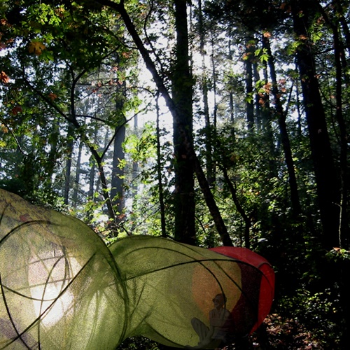
- Juarez blurs the line between architect, landscape designer, and even a sculptor
- Forest Refuge is the link between the environment and man
- It deals with form, and what exactly is the difference between a sculpture and a building
- a building just needs to house a person
- a sculpture doesn't need to house people, but it just needs to take up space
- In this case, I think it would classify as an installation (sculpture) because buildings need to provide shelter and other means for its resident to continue to live (like space for meal preparation or sleep)
- Juarez could also be asking, "are we living in art? Could the spaces we live in also classify as art?"
Multisensory Park, San Luis Potosi Mexico
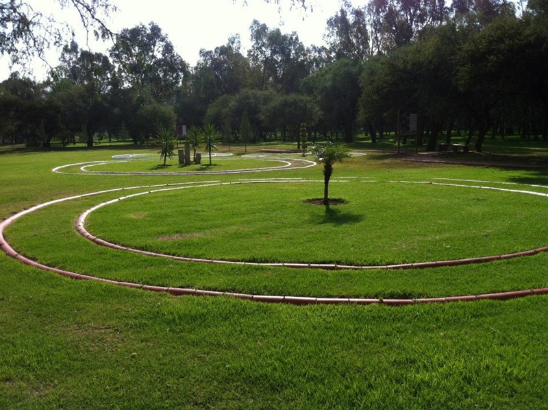
- "The intervention addresses the relationship between site, perceptions, experiences and senses. A landscape intervention dedicated to 'sensing the landscape'. An interventions that connects and approaches with nature."- XStudio, Ivan Juarez http://www.x-studio.tv/projects/landscape-city/multisensory-park/
- In other words, Juarez analysed what it truly meant to be in the park and made it even more:
- rings around a tree give the blind a sense of space between each tree, possibly giving them some mental image of a park
- information boards with Braille, trees with holes and sticks so birds can perch and sing allows a more tactile response
- Juarez still deals with space here, just like any architect
- main difference here is the site and method
- site wise, instead of an empty block he uses the park
- instead of adding new structures, he modifies the surroundings to make it more inclusive

College of Architects Building, San Luis Potosi
(Antonio Cardenas Gorab, Juan Manuel Lozano de Poo and Manuel Márquez)
- More conventional approach to being an architect
- an example of function and form being as one:
- overlapping prisms that make up the building provides an open space in the centre, a space for congregation
- local materials that suit the climate (bricks and certain open spaces)
- a stair and slope combo not only works well, but compliments the sharp edges of the different compartments of the building


NICHOLAS GRIMSHAW, Eden Project, 2000
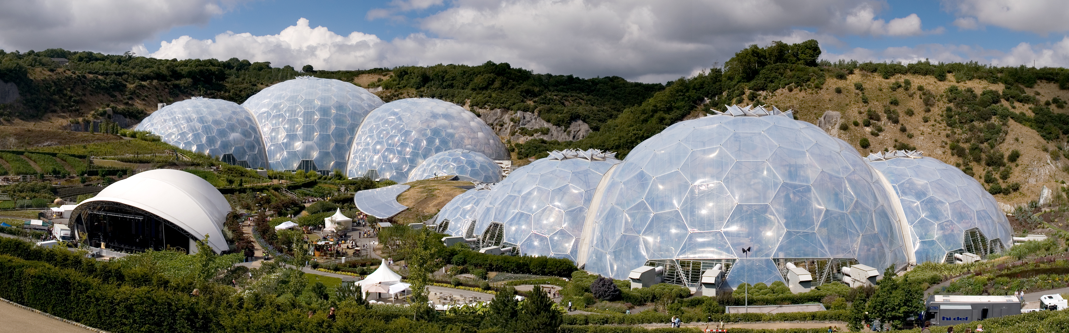
- Inspired by Buckminister Fuller's geodesic domes Grimshaw made some domez... why?
- you see the domes uses the least amount of weight and materials for a very sturdy structure
- it also provides the most volume for the materials used, thats why it makes sense to use them for greenhouses
- To make it even lighter Grimshaw used ethylene tetrafluoroethylene (ETFE), a type of plastic that is also resistant to UV light, lengthening its longevity
Waterloo International Station, 1993

- Grimshaw applying the geodesic shape to form arches of a train station
- Because this is an arch and not a dome, there is need for additional interior skeleton that geodesic buildings do not
- The translucent glazing allows the station to be lit during day, and the surroundings to be lit at night
- An arch makes people realise the space it occupies, a high and curved ceiling gives a sense of space
- Goes back to Yamashita's idea of using curved lines to make spaces bigger than they are
JIM EYRE, CHRIS WILKINSON, Gardens by the Bay, 2012
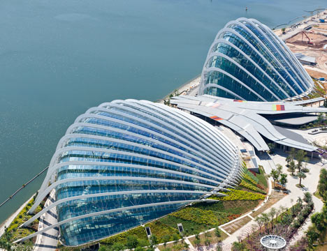

- Somewhat of a national icon now, Singapore's Gardens by the Bay is a big space with lots of plants growing in lots of different places (to put it simply)
- Fuller and Grimshaw's projects reminded me of home, specifically the Cloud Forest and Flower Dome
- There's something between plants and domeish things I realised...
- no internal structures for a dome, which means less shadows and more view
- less surface area to maintain the temperature, in Cloud Forest the temperature is lower than outside, so less electricity is used to maintain the internal temperature
- even though there's no earthquake or natural disasters in Singapore, a dome is also quite strong for its size
MORE ON INTERIORITY
Justice Centre, Portland, Oregon 1983 . (Glass designed by Ed Carpenter)
- Interiority is the feeling of being inside a building, and when you have a 9m arched window allowing colours and lights from outside in, it can really feel confusing
- The outside world is basically captured by textured glass and then transmitted into the lobby, creating this sense of "indoors yet outside" feeling
- Ed Carpenter believes that "Glass design should serve, and take its tone from, the architecture" (Moor, Architectural Glass)
- Glass was only really part of a building, and not just an ornament, quite recently, and nowadays it has become an important part of the building.
- Gropius or Wright might have pioneered the large scale use of glass in their buildings, but what exactly was the push from just stained glass to walls?
Moor, Andrew. Architectural Glass: a Guide for Design Professionals. Whitney Library of Design, 1989.
Lastly, CEDRIC PRICE'S THINKBELT

- long story short, Price wants to use this vast plot of land for a hi-tech school
- he believed that buildings needed to be adaptable because no one knows how spaces can be used in the future
- What I want to say is that although this is a visualisation, Price is just suggesting where spaces could be, and not like blueprinting everything
- He is drawing just enough to get an idea of how this school is on literally on the rails, the scale of people and where things should be
- Which is weird because I thought all visualisations must be 100% correct
I covered a lot of material today, and that was just things relating to the research. Architecture, like graphic communication are both misleading; they cover so much more topics then what they are usually portrayed as having.
Wear It
QUESTIONS:
1) The body is my source of inspirations whenever I work, it's actually quite difficult for me to work without the body in mind.
2) Most challenging bit was translating what I had in my mind to something that can be represented by the limited materials available. I had to ask Helmert how to made it and he suggested cutting the paper like a mail tunic, like a hole in a rectangle.
3) I enjoyed when I got others to wear my vest, when I see my work being worn (in this case not voluntarily, but whatever) it's easier for me to make adjustments and get input from other people. It's always great to get others' perspective on my stuff.
4) I found it manageable to think and create three dimensionally. It seems natural for me to sculpt a shape using my hands then draw it out on the book.
I started out with a crude cut out of the basic shape. I felt that having somebody test my product I can make speedy decisions, based on what I see was wrong. So in this case I borrowed Jimmy's torso and I realised that the vest was too long, lopsided and revealed too much neck (places pressure on the wrong part of the body). I made adjustments and cut out the second version, I realised I needed some strength around the shoulder portion so I gave it an angled surface.
In the future I would like to use an elastic fabric that wraps around the contour of the body, and the weaving would be integrated into the fabric itself. That way, it's a one-size-fits-all and more comfortable to wear.
Use It
So on that day I was absent and I referred to the course brief for the lesson. I am fascinated by the Bauhaus movement, as I always thought design should be for everybody, and why did it took so long for somebody to figure it out. I studied various chairs by Alber, Gipsen, Gropius, and Breuer and discovered how they utilised strong lines and stemming out from geometric shapes to form the chairs. I also researched the modern chairs designed by Chadwick and Stumpf. From there I designed a chair with just comfort in mind, made a few revisions and made a little cardboard visualisation of it. I continued on another chair design and visualisation the next day, this time asking for the opinion from my peers.
Big Ideas (the essence/broth of my journey)
- I believe design should make everyday life easier for everybody, that's why I resonate with the idea of Bauhaus and Productivism (Rodchenko especially)
- Interesting to see shift in focus of "whats good"
- Back in 1900's it was all about how to make it cheaper, lighter, more modern and easier to produce
- Nowadays it's how to make it "greener", have a higher quality, more craftsmanship behind each product,
- WHICH IS WEIRD, because as far as I know we are still the same species of people, why exactly our preferences for each product changes is weir-
- Knowledge of our surroundings, new research into materials and the invention of mass communication has shifted our desires, furnitures included
- Simply, everything and everybody is now "closer", your problems are now mine, and I need to be more unique because now everybody can see each other...
- Design trend changes, I saw it evolve from inspiration from bicycle frame to posting a blueprint online for all to make the chair
- Ultimately good design should boil down to everybody, I'm no communist but hey everybody should get assess to an Aeron chair, it doesn't make sense to price well designed products beyond what the average joe can afford
So I can pass
- I was inspired by Chadwick and Stumpf's emphasis on the lumbar support on the Aeron, I decided to take that aspect and base my chair off it
- From personal experience, a good chair provides good support for the back, and it's something you realise only when you sit on a bad seat
- Since I was going for comfort in mind, stackability and weight wasn't very important
- these chairs would be either lounge or office chairs, and they didn't need to be moved very often
- I wanted a unison of materials like Alber's armchair, the weighty feel that makes the chair feel solid
- Everybody wants a chair that pleases both to eye and bum, what's also important is that the design can influence people's behaviour
- I actually talked to the poet Anis Mojhani before, and he told me the reason why he does what he does is because he believes his poetry can inspire people to be better versions of themselves, likewise why can't my design do the same?
- Everybody wants a chair that pleases both to eye and bum, what's also important is that the design can influence people's behaviour
- I made my chairs from cardboard and popsicle sticks, because I knew my peers just used paper in class, so this was like an added difficulty
- It was difficult to materialise my drawings
- I struggled where I made suggestive lines on the design, I'm used to working with feelings, something like how Cedric Price uses just enough lines on his drawings to suggest a space
- Unlike Price, I cannot do that because I can't even get a decent chair planned out
- Again I had the struggle to balance how I work versus what the final product should be (messiness < neatness)
- Creating the actual models was difficult
- cardboard has this wafer sandwiched between the two outside layers, cannot really precisely fold
- cannot create small models either because the cross section is wide, and it is not sturdy
- To overcome these problems I used my glue gun
- But in the future I'll stay away from cardboards for small visualisations, and also actually have an actual plan
In the future:
- Don't miss lessons, go even you're super sick
- Research can also be done with books...this project I relied solely on the internet
- Honestly I feel I missed the goal of this project, I did everything on the brief but I don't really feel I got the lesson...
Build It
1) The term interiority. It was an aspect that I never thought about, for me being inside a building is obviously different from being outside. After studying and analysing the specifics what it truly means to be interiors, I kind of get an idea of what it means to be inside than outside. Secondly, architecture is more art-ish than I thought. In my mind I picture people planning structural integrity or load on specific bits of the building. Lastly, my ideal architect before this lesson was Howard Roark, the protagonist from Fountainhead, bravely individualist. I always thought the artistic vision behind a building should be from a single person, no matter how close collabs can be it might dilute the goal of the architect...right? Well, aside from the workload, the money, and knowledge of several different fields working alone is possible.
2) It was difficult to merge our structure with another group's. Most of the time I felt it was a one-sided conversation where what I say is what happens, because I feel the whole point of a collab is where different opinions come together and something good comes out of it. The actual making of shapes wasn't anything novel, it was just trying to create something I can be proud of that was difficult. I was imagining a structure that spans a lot of vertical space that sprawls around too.
3) Visually it resembles a very jagged and long structure, so it would make sense to translate that to an article of clothing, something with lots of edges and extra volume that run along the contours of the body. Sculpture-wise, an installation that snakes along then ends abruptly like Libeskind's museum.
4) I expected architects to be very mathematical, but I guess that only applies to designers. The more technical job probably is also an architect, just focuses on different things. An architect really does many jobs, and in reality they have firms where different people split up the project and focus on specific bits.
Step by step progress: original structure, after merging with the other group, covering sections with paper and tape
What started out as a desire to expand the structure vertically grew into obsession with integrating into the landscape, specifically something tall and cliff-like. I feel cliffs have the potential to house buildings, sure assessibility is difficult, that's why I based my building in a quarry, which is conveniently also in a park. For the Mati temple, most of the temple is actually inside the cliffside, and only the viewing galleries or exterior of the shrines are visible on the outside. Likewise, my building primarily is inside the cliff, with just the greenhouses and access visible outside.
Most of the feedback regarding our structure was its integrity and jaggedness. Some see it as moving, being playful, or having random colours. I feel people tend to animise buildings when they don't recognise it straight away-- they ascribe human qualities to it because it's something they are very familiar with.
Inspiration for visualisation:


Site for building: Butik Bitmah Quarry (Singapore) Building inspiration: Mati Temple (China)
Finished visualisation
While creating the original structure with sticks it was difficult to have it stand upright without wasting the sticks (having two sticks joint the same way). We kind of fixed that by including the cube and wall into the structure. In the future if I had more time I would direct the group to focus on integrity whilst expanding upwards. Or maybe next time properly build the archimedean shapes before advancing any further.
I'm beginning to see that I'm always in conflict with my tendency to go wild, and in the reflections I say I will try to mend that. Maybe it's not meant to be mended, or just it's super difficult to rid this awful habit. I have no idea.